Wonkify: micro-decorating move #21

The weekly micro-decorating newsletter * Issue 10 of 13, A24 *
Subscribe free *
Crooked things are attention magnets. Take Pisa's famous tower, an engineering mistake become beloved destination. When I visited years ago, other travellers would approach me in a state of frantic delirium: "Where's the Pisa?" they'd ask, desperate for directions.
The tilting column is so potent it spawns replicas of itself, scaled-down models to fit in your luggage and transport home. I was stunned by the volume of tiny versions available, an army of copies in shops that remain off-camera in the typical tourist photos.
You can save on airfare by playing with the off-kilter in your own world. The effort it takes is minimal. Take a look at one of my favourite book covers for an example of how a few small shifts can achieve surprising results:
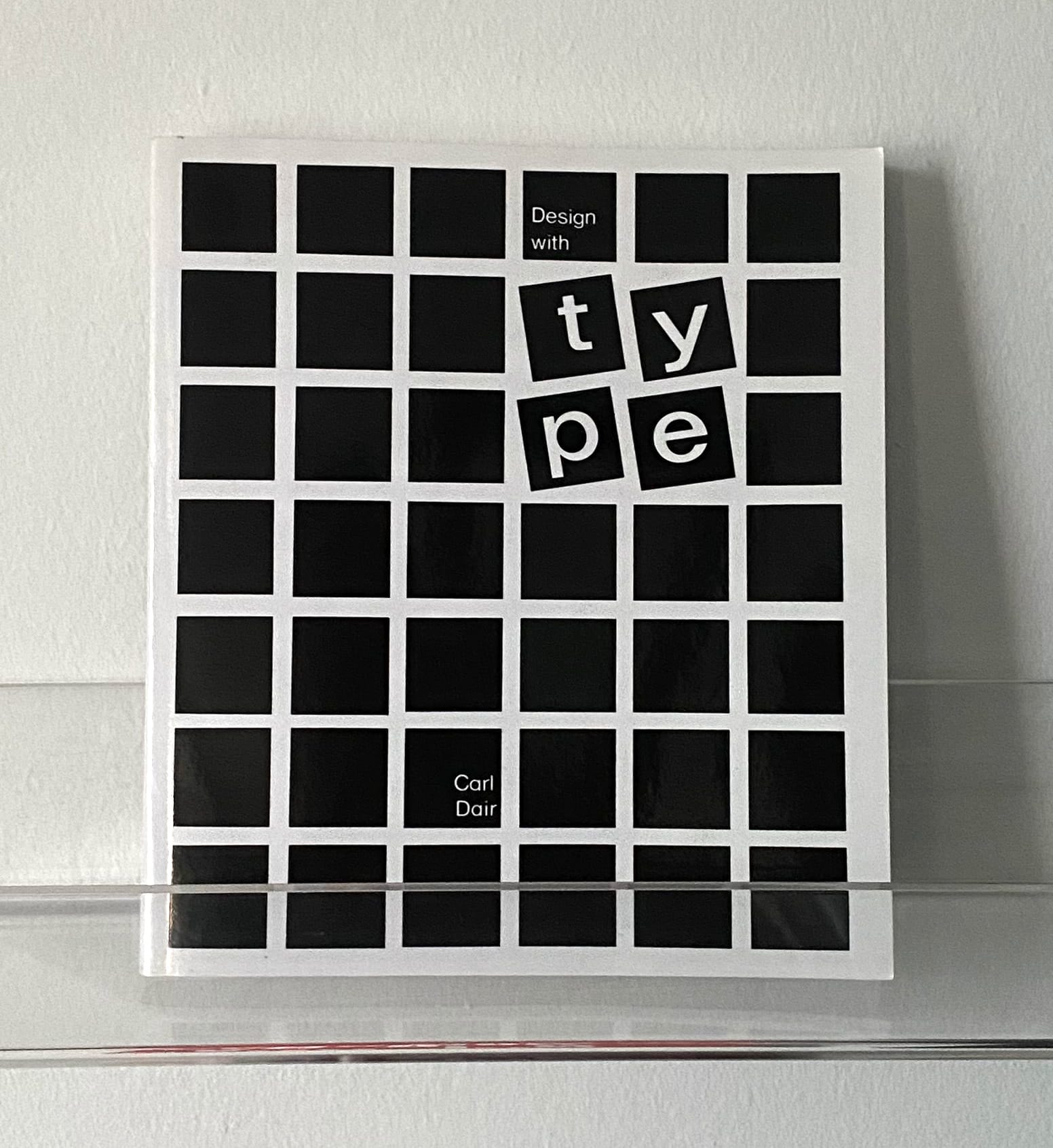
Try this at home by monkeying with your furniture layouts. Instead of a side chair perpendicular to your sofa, see what happens when you turn it towards the larger seating area. A formal mood gets more relaxed with the addition of an unexpected angle.
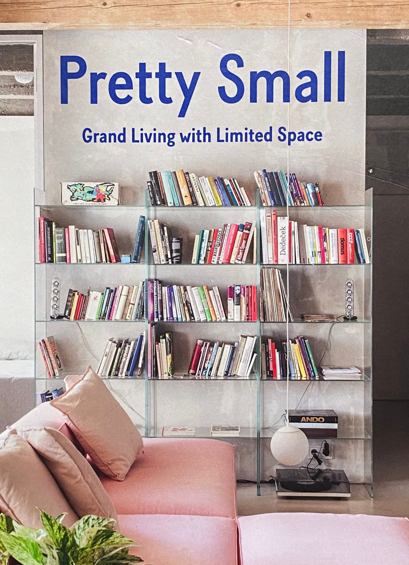
Bookcases offer the same opportunity. Instead of limiting yourself to horizontal and vertical spines, allow some titles to casually lean. It creates an unstudied effect that feels inviting:
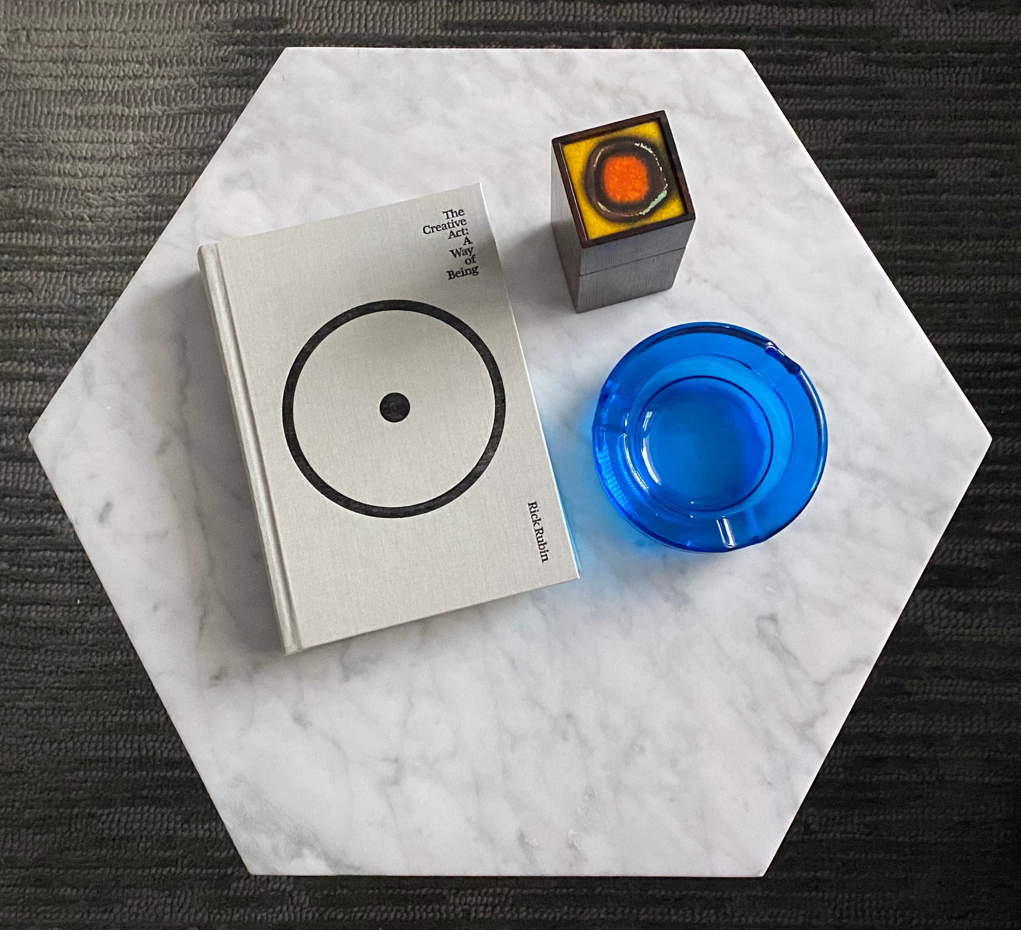
Tabletops are the perfect canvas for wonkiness. Try starting with three objects that you enjoy seeing together:
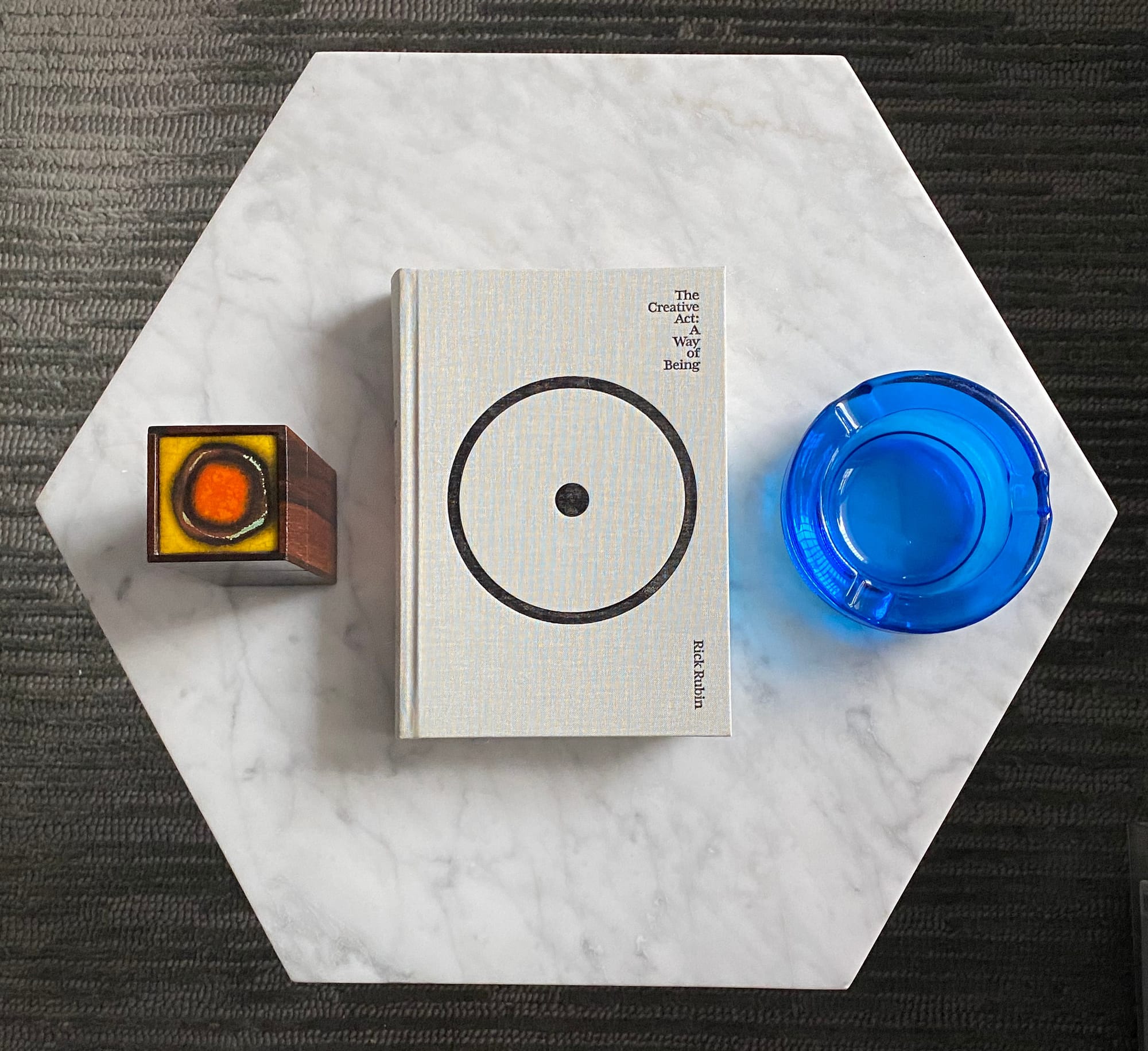
Move them around to find relationships that aren't the obvious ones:
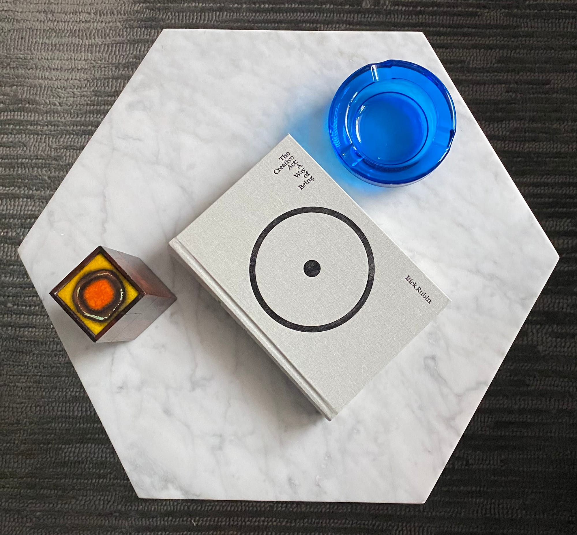
Eventually, you'll find a placement that feels pleasingly irregular:
Wonkifying has a wide spectrum. At one end, there's the flippant move that seems comically lazy:

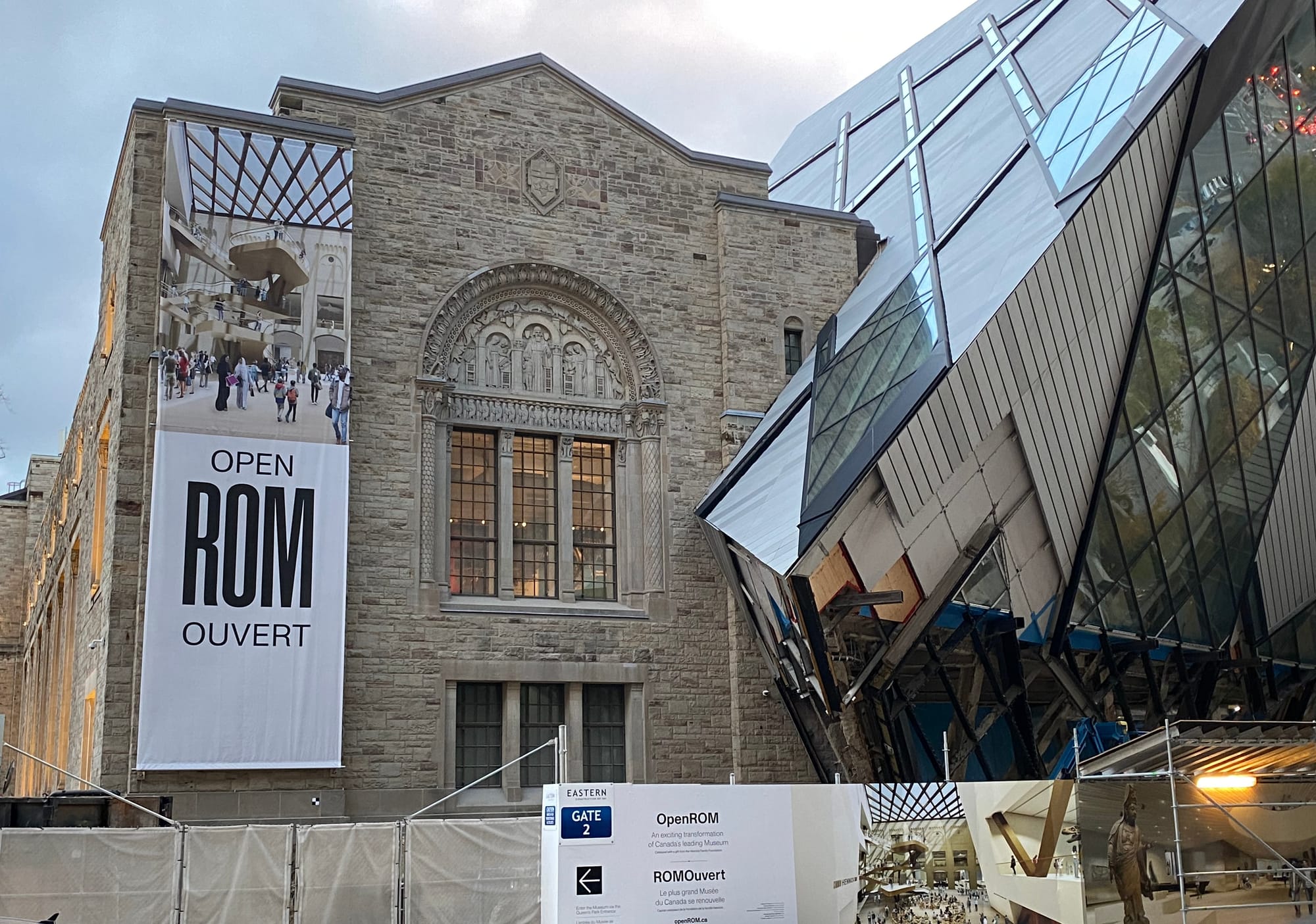
At the other end, there's effort so strained it's embarrassing, like the ROM's ill-conceived addition, now undergoing revisions at great expense:
In between, there's a promising domain allowing for many satisfying experiments in the cockeyed and askew. You can even find those experiments in a single object.
My favourite spot for wonkified things is Bonne Choice, where vintage and contemporary home furnishings mix in an Aladdin's cave of marvels. After I wrote about them in June, they hired me to write some product descriptions for their website, and it was thrilling to find words for some of their more outlandish offerings.
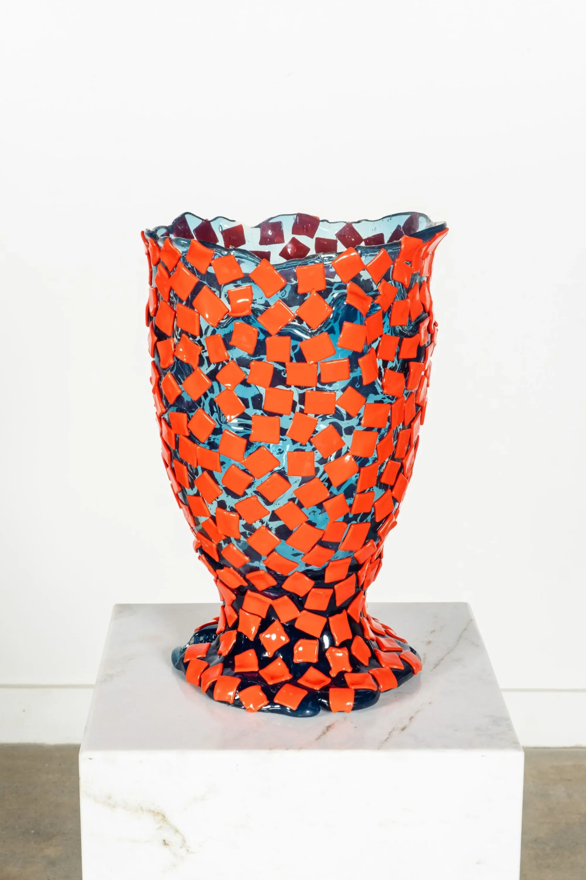
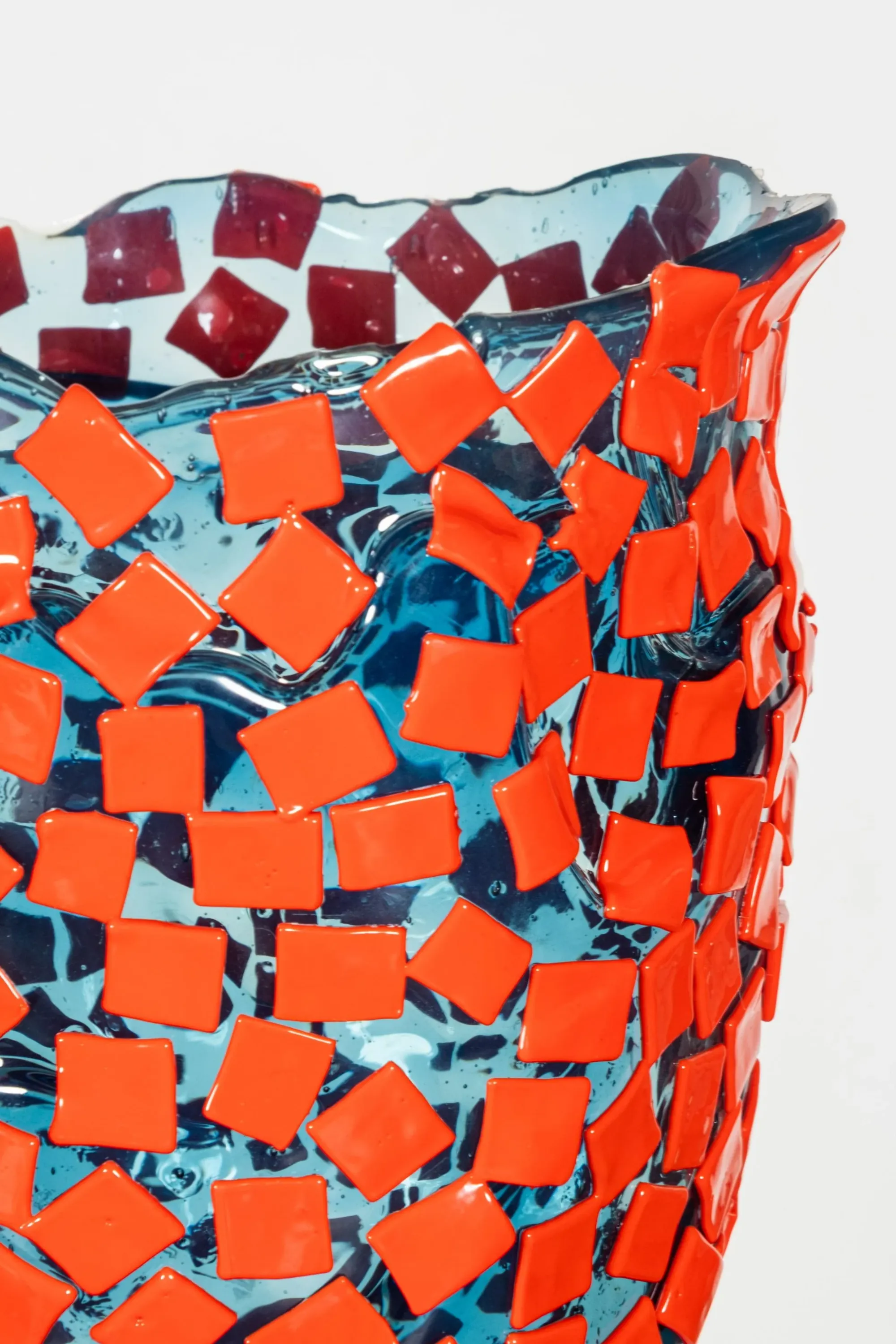
I'm especially keen on their Gaetano Pesce vases, whose forms defy predictability:
Thankfully, once you become attuned to wonkiness, you won't have to look far to find it. Another classic that's ready to shake up your surroundings is the "Blow up" series from Alessi. The magazine holder, for example, has an explosive energy...
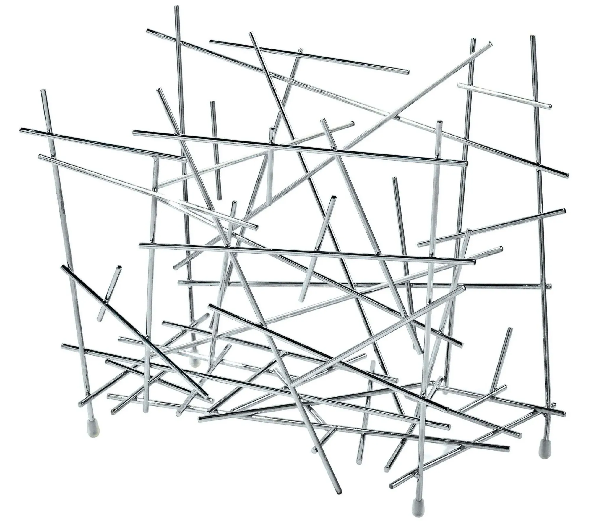
...while still obediently performing its required task:
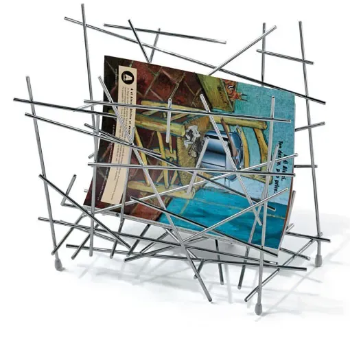
The moral of the story is you don't need to fly to Italy to gasp at legendary crookedness. With some creativity and footwork, you can enjoy it under your very own roof.
From the archives
Check out In praise of waviness for more inspiration on how to freshen up your space.
Thank you for reading.




Member discussion