The Netflix decorating secret

The weekly micro-decorating newsletter * Issue 1 of 13, SS23 *
Subscribe free *
If you've been reading this newsletter for a while, you know I'm always urging you to train your eye through real-world pursuits – browsing displays in bricks-and-mortar shops, studying the colours of favourite objects, or even perusing the decor of condo lobbies.
But sometimes, digital prompts can strengthen our design muscles too.
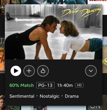
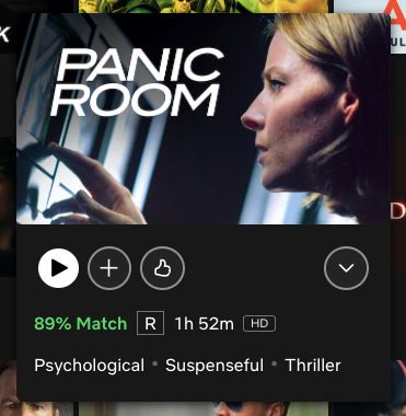
An under-the-radar feature of Netflix is a good example. When you're scrolling for something good to watch, each tile you hover over expands to reveal some key details to help you make a choice. The last element is a three-word summary that captures what's essential about this pick:


If a two-hour movie can be condensed into three words, it's likely the style of an interior can be encapsulated the same way. You'll want a different set of terms, though. "Scary," "Unpredictable," and "Shocking" might be great for Saturday night entertainment, but not for the look of your kitchen.

When I started revamping my apartment in 2019, I chose three words that got to the essence of how I wanted my place to feel. They're too personal to reveal here, but to get you on the right track, here are 50 adjectives that you could draw from to create your own set of three:
See which terms excite you, add your own if needed, narrow it down to three, then shuffle the order for a combo that clicks. Voilà: you now have a personal style code to help you navigate design decisions big and small. Four years after coming up with mine, I'm still using it as a mantra to determine what comes into my space and what has to leave.
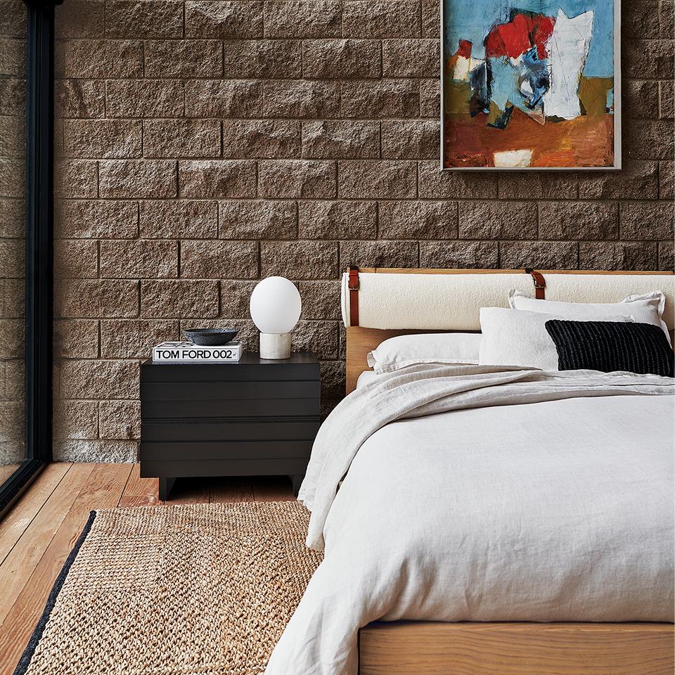
The beauty of this technique is you can reverse-engineer it from photographs as well. For example, here's an image that grabbed me from CB2's new Lawson-Fenning collection:

What appeals to me first off is the variety of natural materials – rough stone, knotted jute, sleek wood, buckled leather. I'd pick the word earthy to cover this first impression. Aside from the colourful painting, there's a limited range of hues, so I'd pick restrained as the second word. The floor to ceiling window floods the space with natural light, so I'd pick luminous as word number three.
Earthy, restrained, luminous. This could be the style code for a room of my own that looks far different from the inspirational source, but has the DNA of what I find desirable in it.
In the end, there's no single right answer, since the words you'd use to summarize an image would likely be different than mine. It's the act of coming up with those terms that allows your creative instincts to arrive at something uniquely you.
What three words would you choose for rethinking your space? Let me know in our new Comment section below!


Member discussion