Kensington edition – How to shoplift ideas

The weekly micro-decorating newsletter * Issue 7 of 13, A24 *
Subscribe free *
A stroll through Kensington Market is a refreshing palate cleanser. In a city that increasingly goes for the glassy and gleaming, it's a relief to spend some time with the weathered and worn.
There's a more freewheeling creativity in store displays here. While I'm fond of lifting ideas from the pristine shop windows at Yorkdale, it's just as likely I'll find inspiration in this unbuttoned neighbourhood. Here are five venues whose offerings recently caught my eye.
Bazaar Toronto
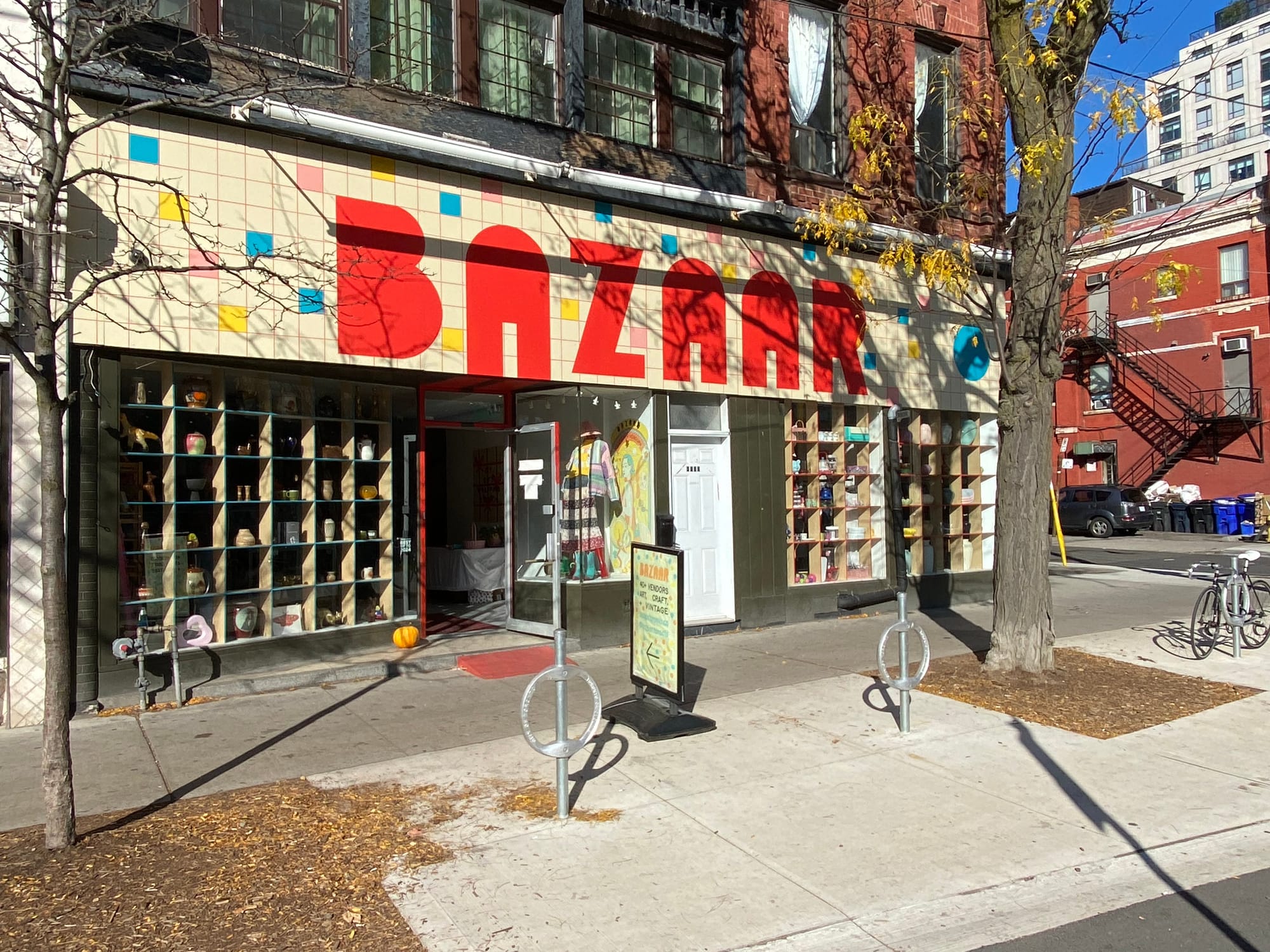
"Variety is the spice of life," my Dad loved to say, and Bazaar Toronto is an embodiment of that motto. It's a marketplace full of tiny stalls where vintage goods and assorted curios are available. The facade uses a grid motif to unify the chaos, with multicoloured tiles dancing around big red letters:
A more sedate grid marks the sign's diagonal turn and turn again to the side street presentation:

Fittingly, a grid is also the organizing device for everything you see in the windows:
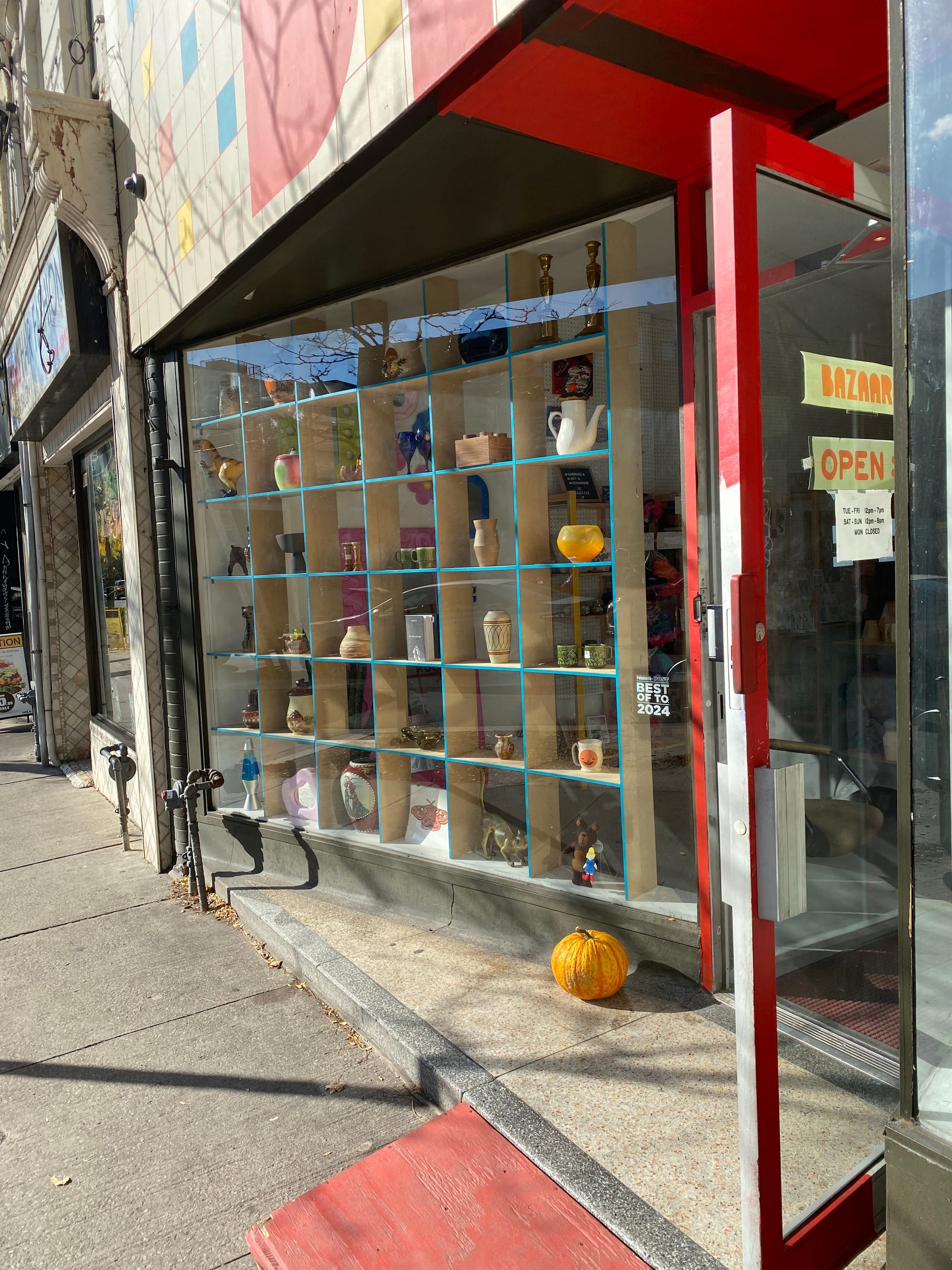
The turquoise blue edges of the structure add emphasis:
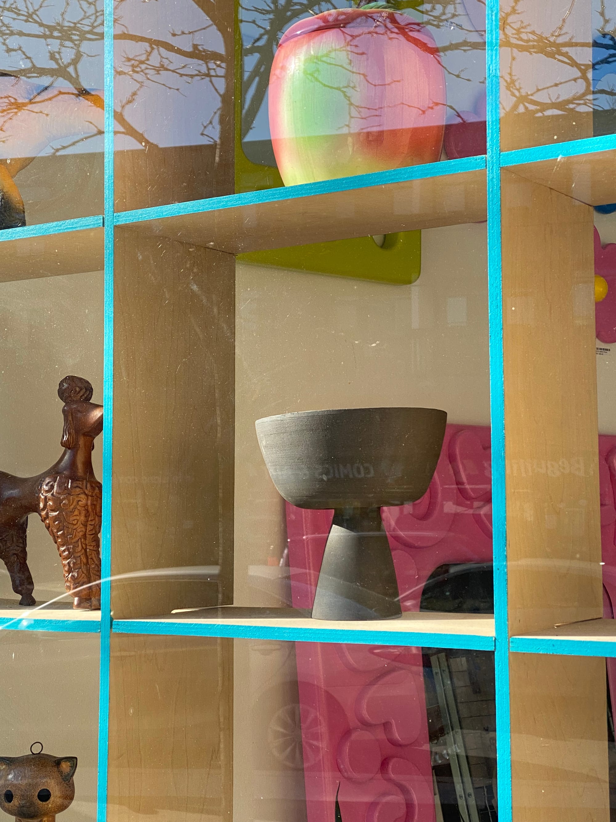
Each object has its own little stage, while contributing to the overall sense of abundance:
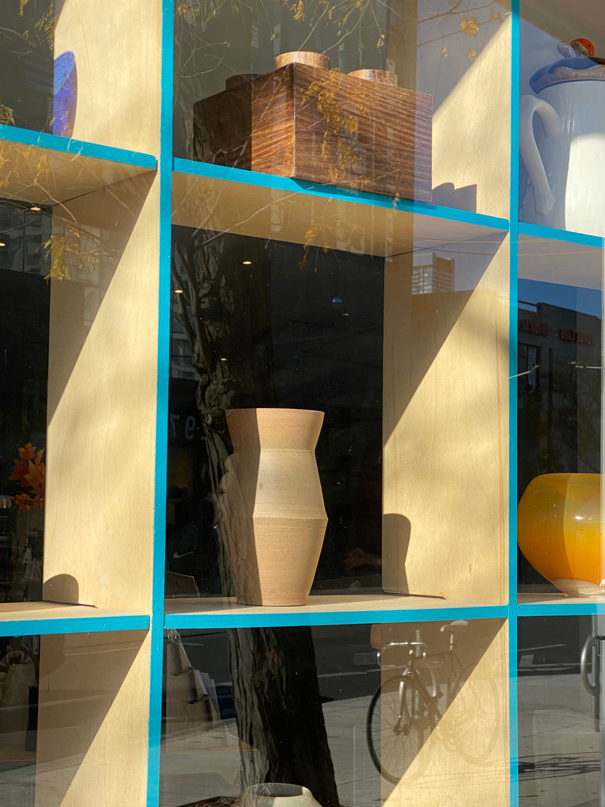
It's an effect you can easily create at home with a grid-based display cabinet. I recommend Ikea's Kallax series, for an affordable and flexible way to tame your favourite objects while still allowing them to seem unfettered.
Balfour Books
Design articles about displaying books are rife with tedious arguments about whether it's okay to sequence titles by colours of the rainbow, or place spines inwards to create a more uniform impression. So, it's good to visit an actual bookshop and get to know other ways of arranging your favourites.
At Balfour Books, I enjoyed this scene right inside the shop entrance:
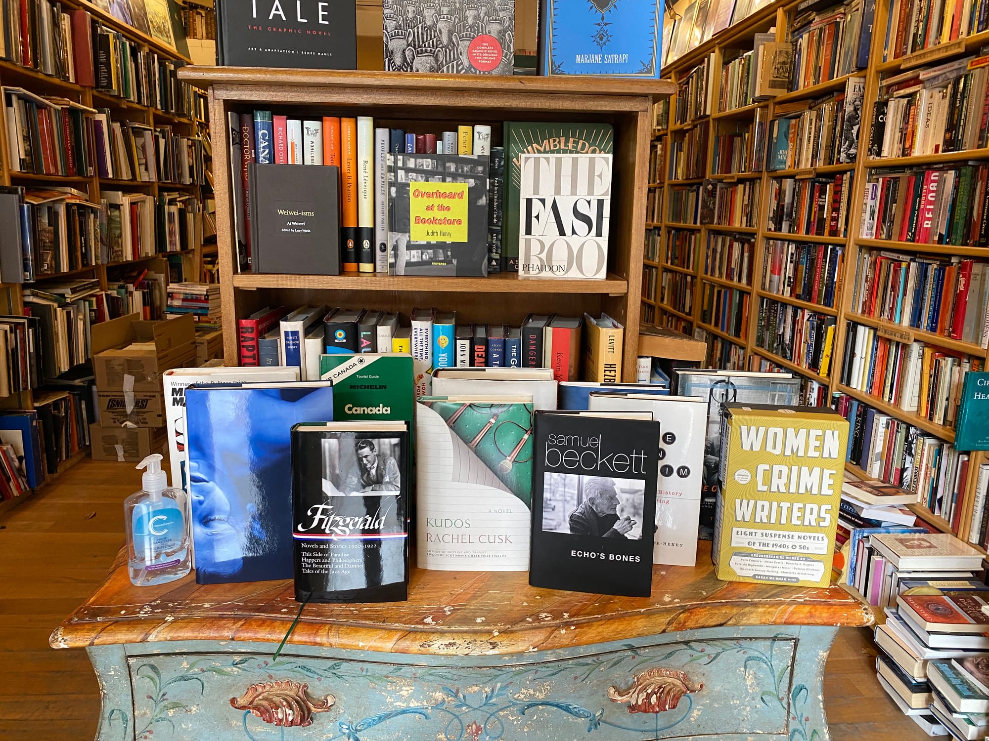
It feels like a welcoming crowd at a literary party, motivating you to mingle. All it takes is angling the front and back covers of each book so that it can stand upright, then building a spontaneous collection. I can't wait to try this out at home.
Causa
The jewelry shop Causa also has well-loved books in its inventory. Check out this vignette at the store entrance:
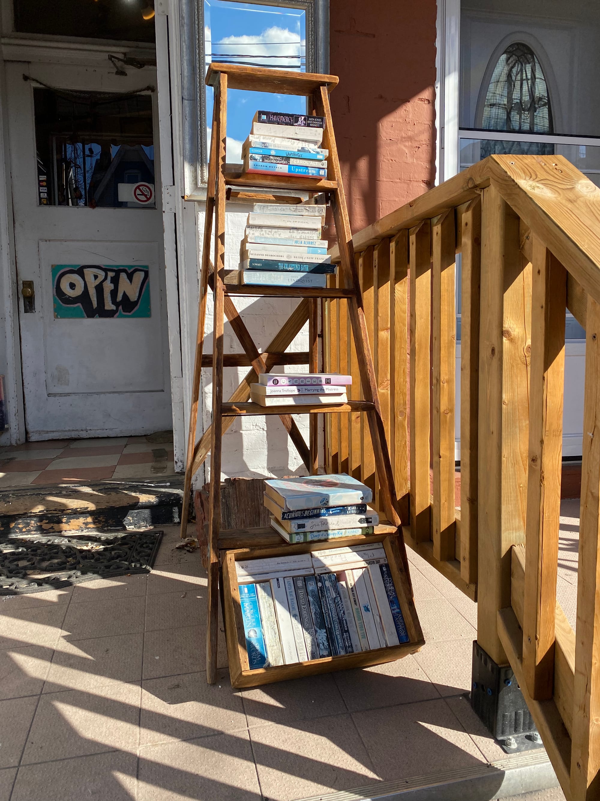
It's a prompt to make you think beyond the bookshelf. Books, gravity, and a few interesting surfaces are all you need. I'm a fan of the mirror at the top of the stepladder too. It's a nod to the fact that a true book lover might be a bit head-in-the-clouds.
Alchemy Vintage by Stephanian
The windows at Alchemy Vintage are jammed with stuff and protected by ornately scrolling bars that resemble balcony railings. Whenever I pass by, the shop is closed, but I do pause and examine the merchandise on view. What seems like disorder reveals subtle intentions after a while. I like this eclectic lineup of keychains:
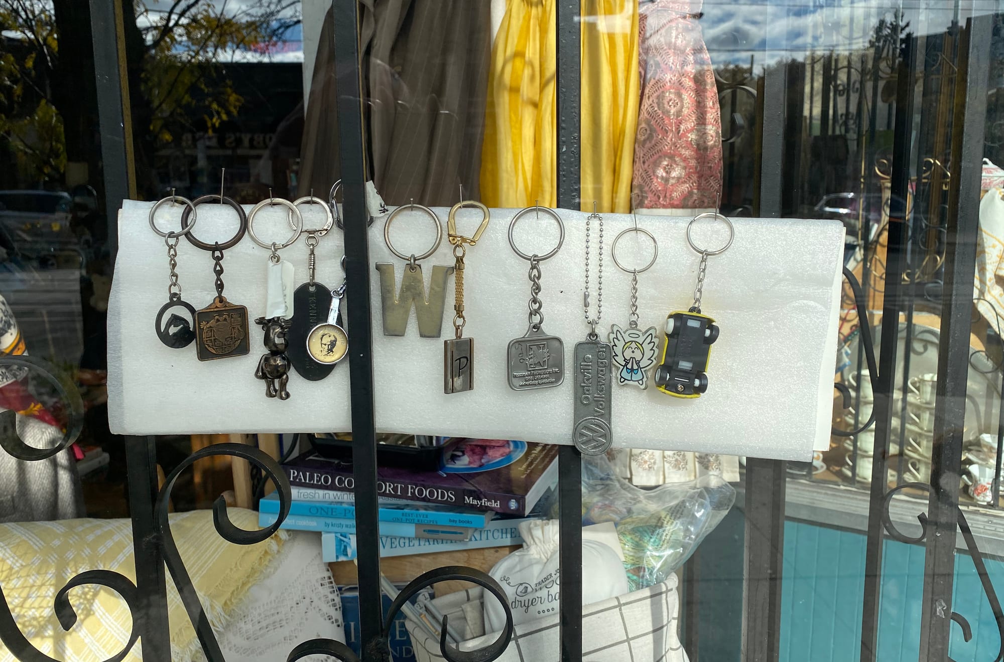
It's a reminder of how simple a collection can be. Take a few related items and put them together. Add some more. See what happens.
The Arch Cafe Bar
Kensington wouldn't be Kensington without a dose of kooky. This crocheted tree warmer on the patio of The Arch Cafe Bar had me smiling in appreciation:
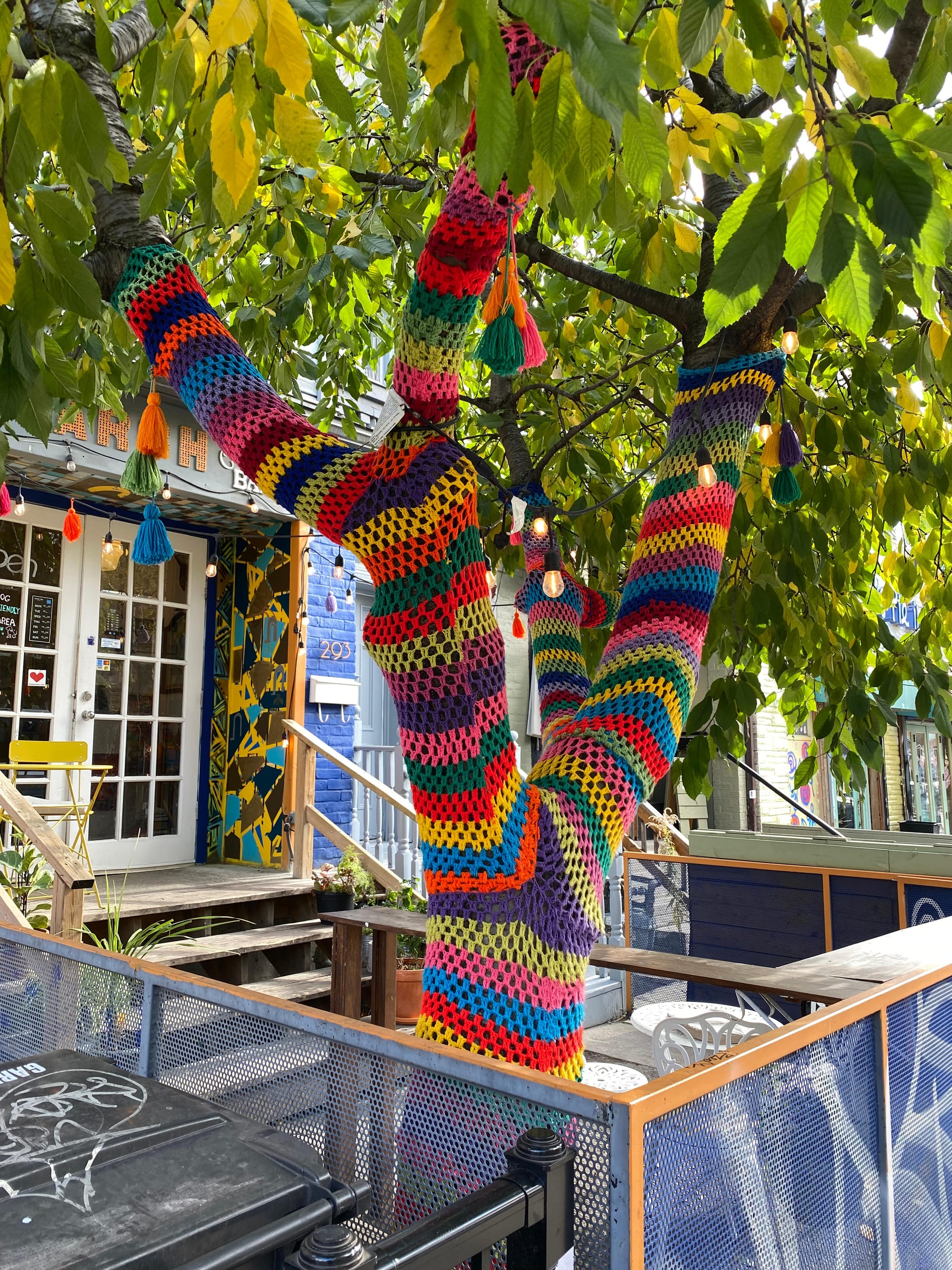
It feels urgent that I do something with this sight, but I'm not sure what. An afghan throw on my serious-looking armchair? Turtlenecks for my plants? I'm still processing; I'll get back to you.
Over to you
Have you seen a store display recently that fired up your creativity at home? Drop a note in the Comments below. Or if you're feeling shy, shoot me an email. It could be the start of a new "shoplifting ideas" roundup, and I'll give you full credit if it is.
Thank you for reading.





Member discussion