How to shoplift ideas

The weekly micro-decorating newsletter * Issue 6 of 13, F23 *
Subscribe free *
Shoplifting may be against the law, but there's a perfectly legal version that any design-conscious person learns to practice. It's the lifting of display concepts from retail environments and making them your own. You'll arrive home with credit card unused and brain overflowing with ways to freshen up your space.
In many cases, you can use your ingenuity to create the same effect with what you already own. In others, you can pick up the gear you need at vintage dealers, your nearest IKEA, or quirky independent businesses that crave your patronage.
On a recent trip to Yorkdale, I went around snapping photos so you can get the gist. Here are five shops whose windows warrant a second look.
Longchamps
The French purveyor of leather goods used books as a pedestal, something I noted in two other shops as well.
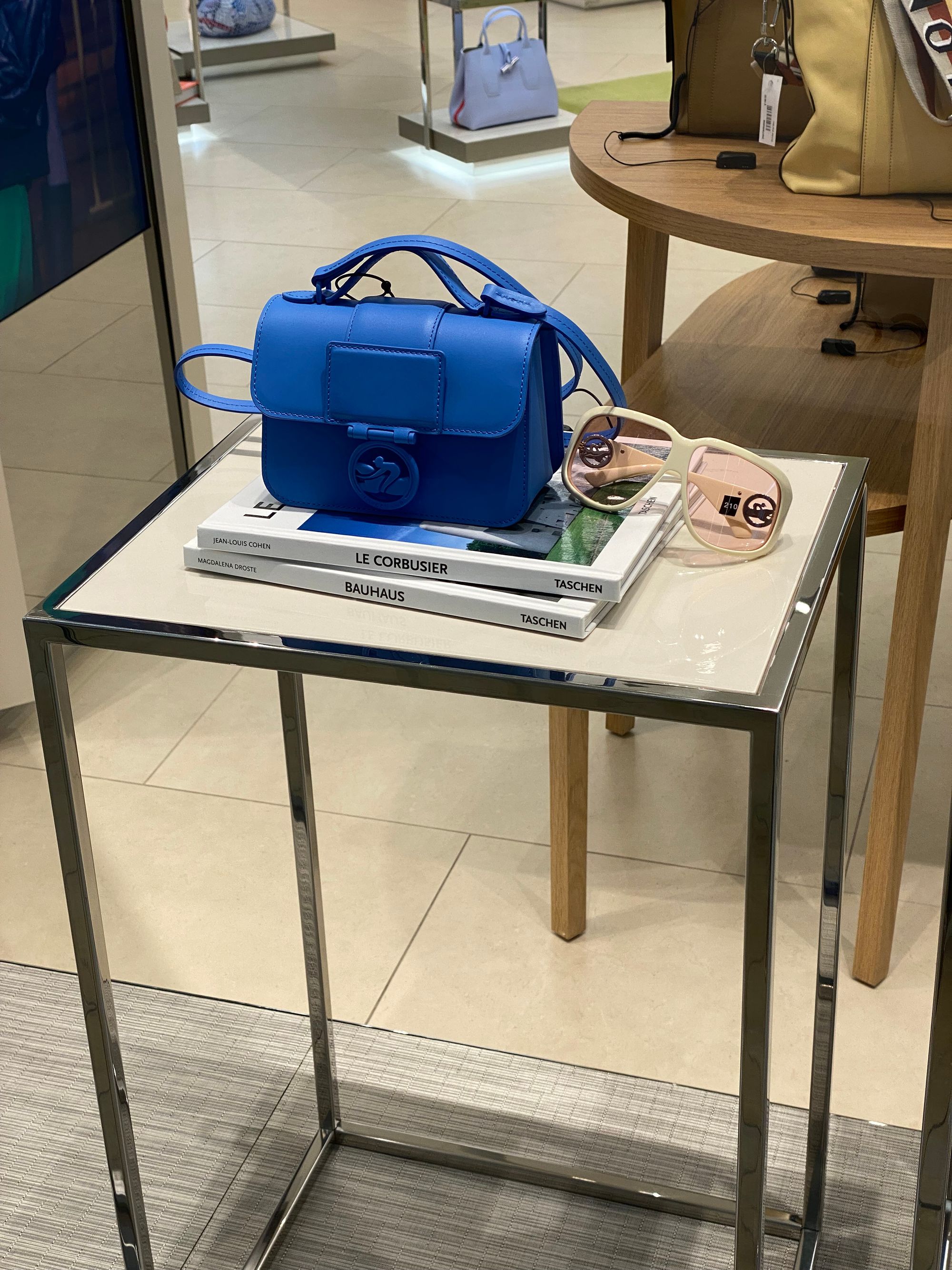
Literary purists might cringe, but as a dedicated book lover I give you permission to do this with impunity. It's fun, easy to switch up, and even more creative if you play with how the book titles relate to what's resting on top.
Taschen's Basic Art Series, examples of which are in the photo, offers an affordable way to add oomph to your book collection, while allowing for quick pedestal-creation.
Massimo Dutti
The Spanish clothing retailer used a simple yet powerful way to catch the eye: a sphere. The abstract form brings out the sculptural qualities of anything you place nearby.
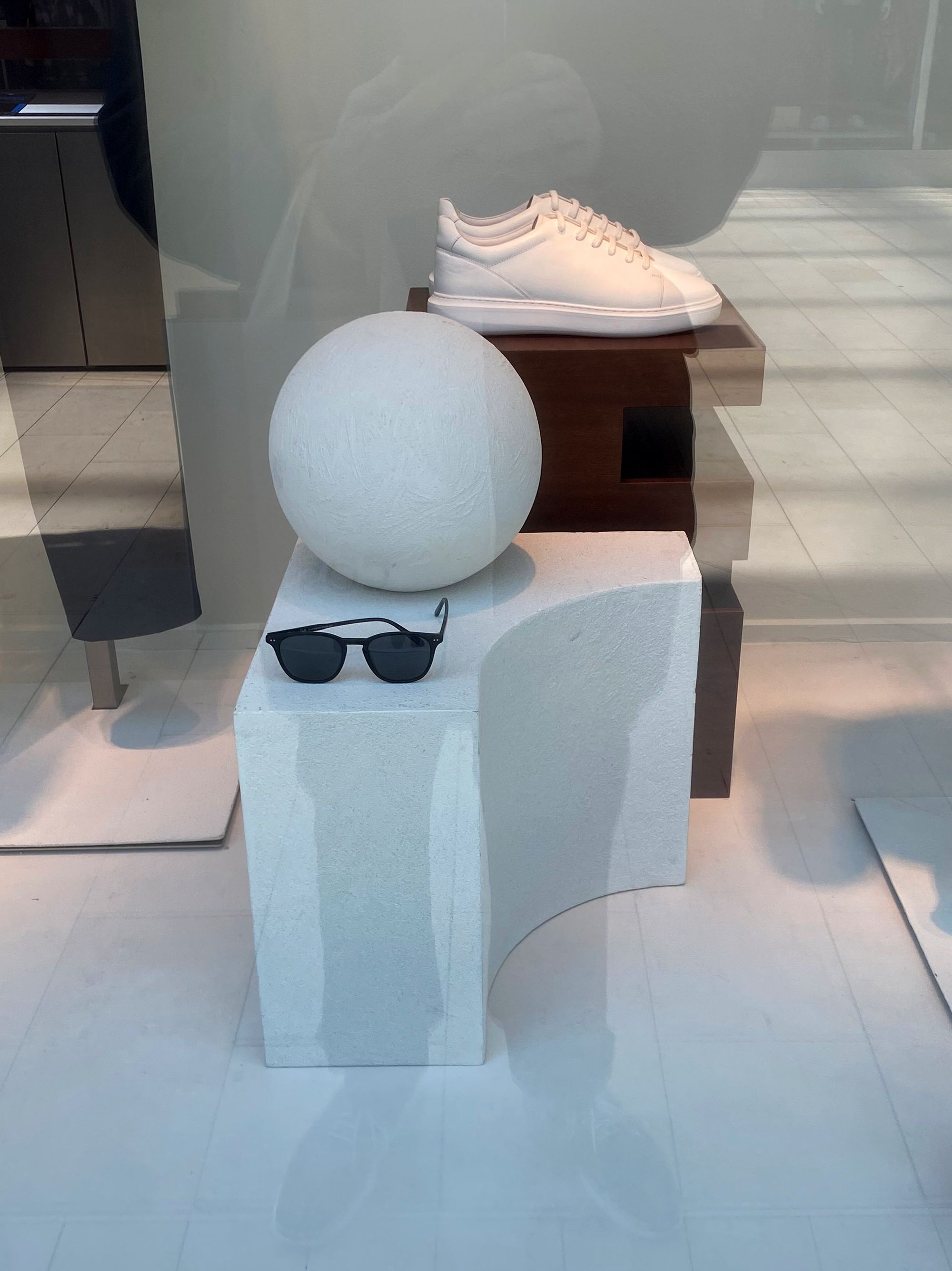
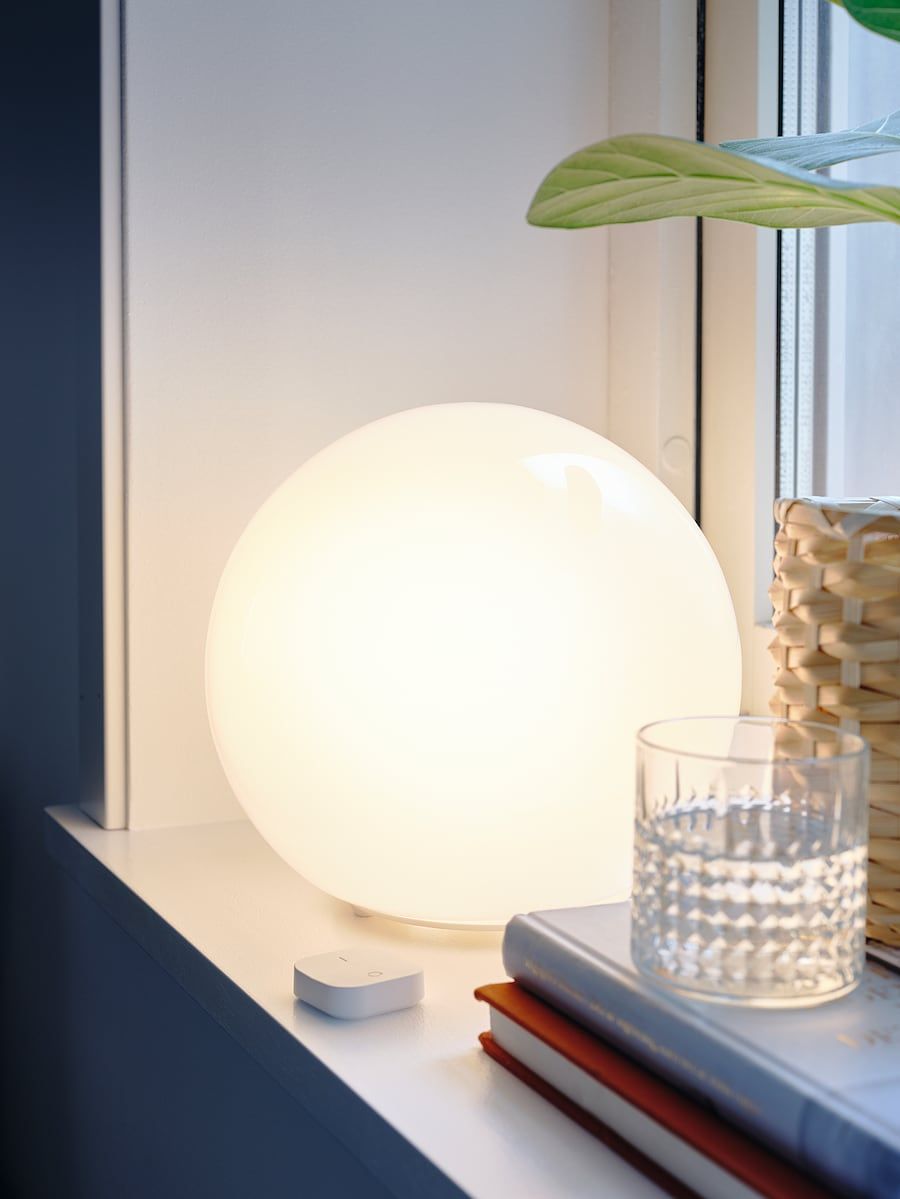
Spheres are easy to find and come in all sorts of materials, from glass to wood to marble. For extra punch, you can get one that doubles as a light. I'm a big fan of IKEA's Fado table lamp, which looks great on or off, and blends seamlessly with more expensive pieces.
Hudson's Bay
At the department store entryway, a cluster of mannequins sported saturated colours from all over the spectrum:

You might find it too over-the-top for your taste, but it certainly demands attention, and if anything, urges you to develop courage in what you place side by side at home. Try taking two items that "clash" and see what happens when you display them as a pair.
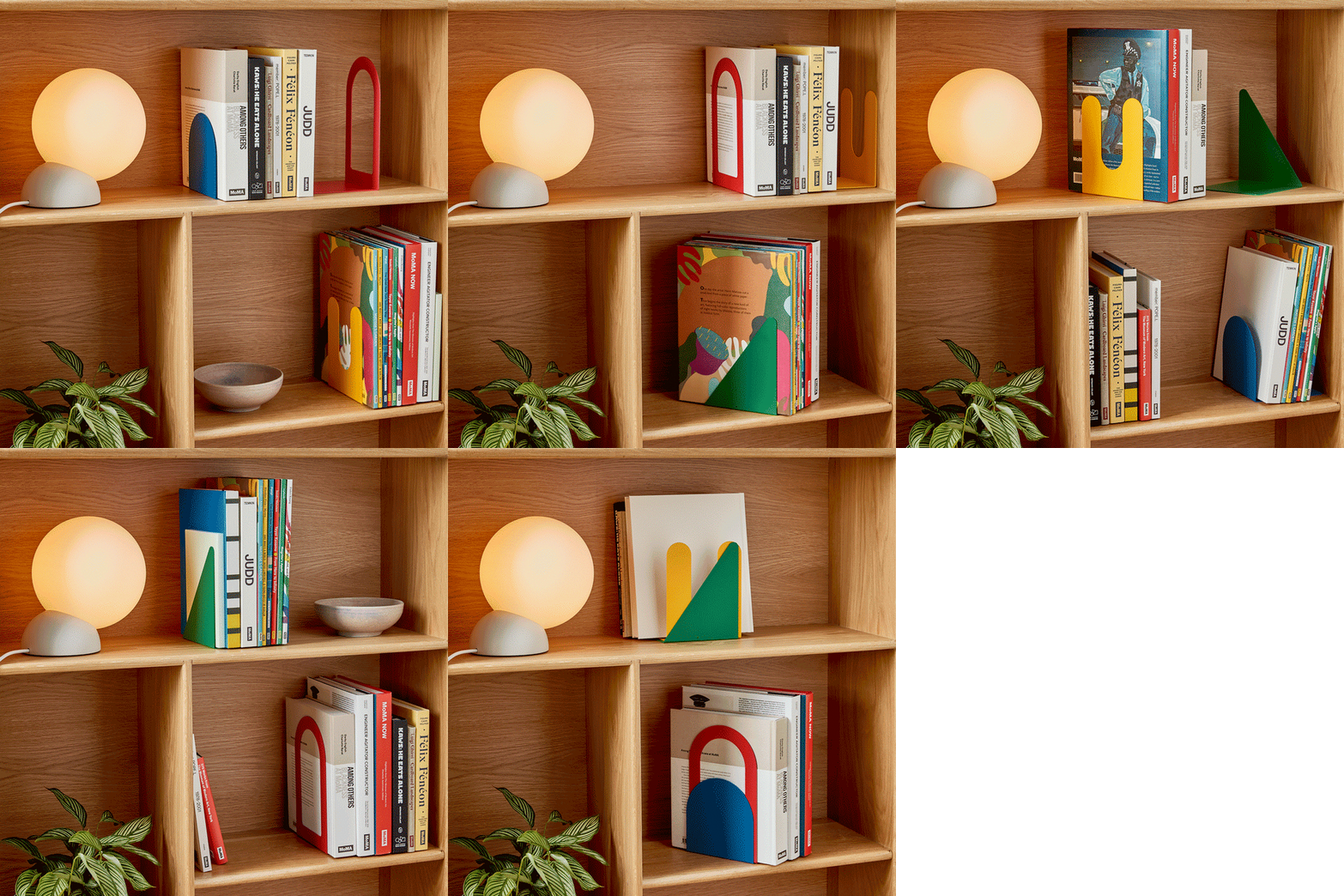
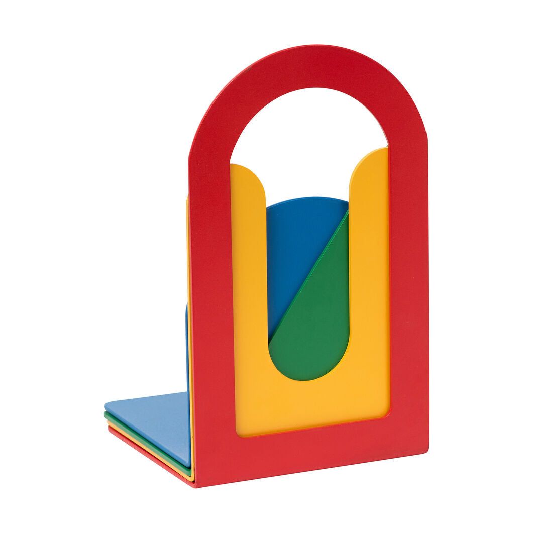
Or, go gently into world of colour friction with a set of four book ends, available at 313 Design Market. You can use one when you're feeling timid, or all four when you're at your wildest:

Browns
This shoe store took the go-big-or-go-home approach, with a gigantic sneaker pulling you inside:
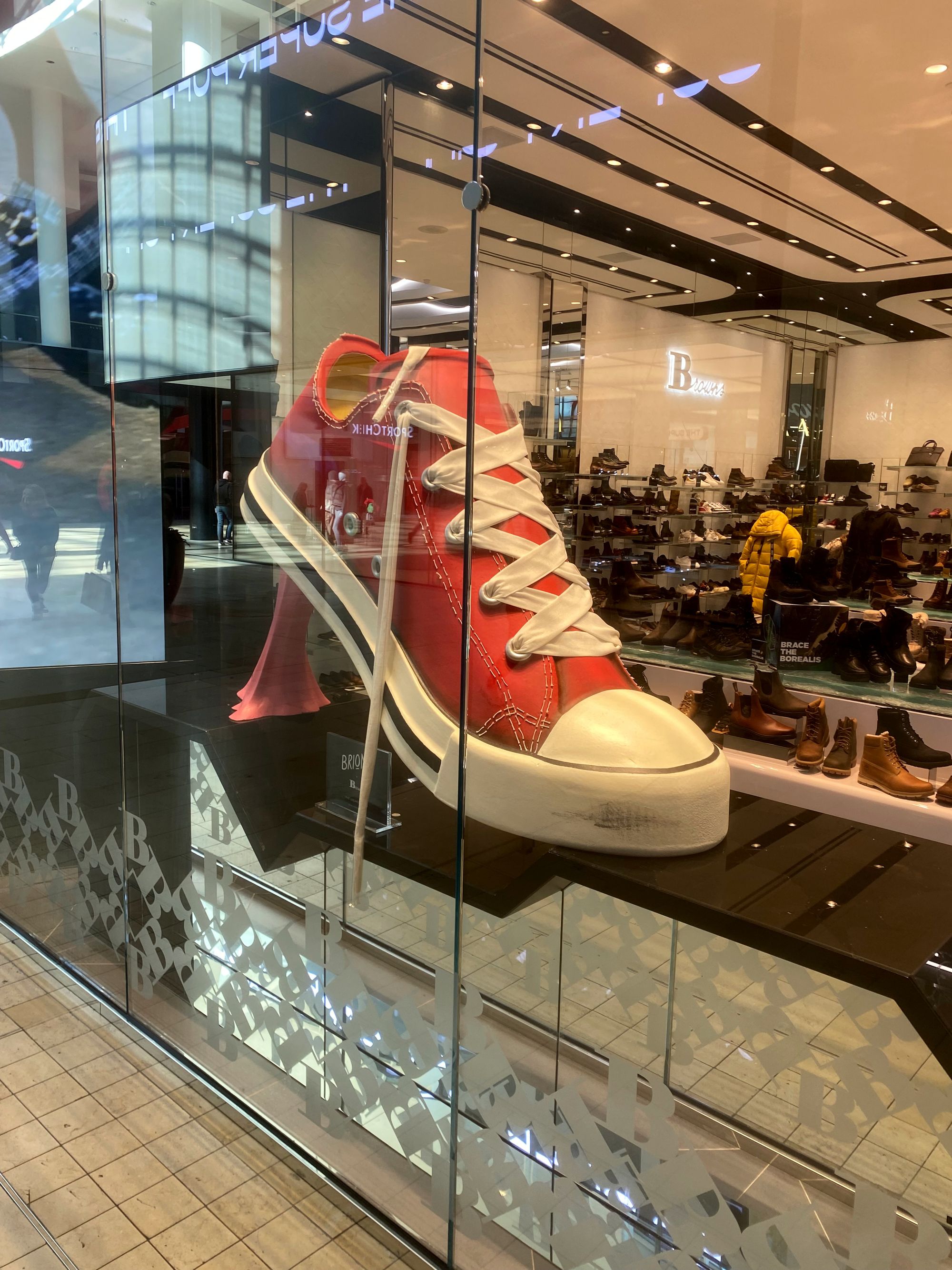
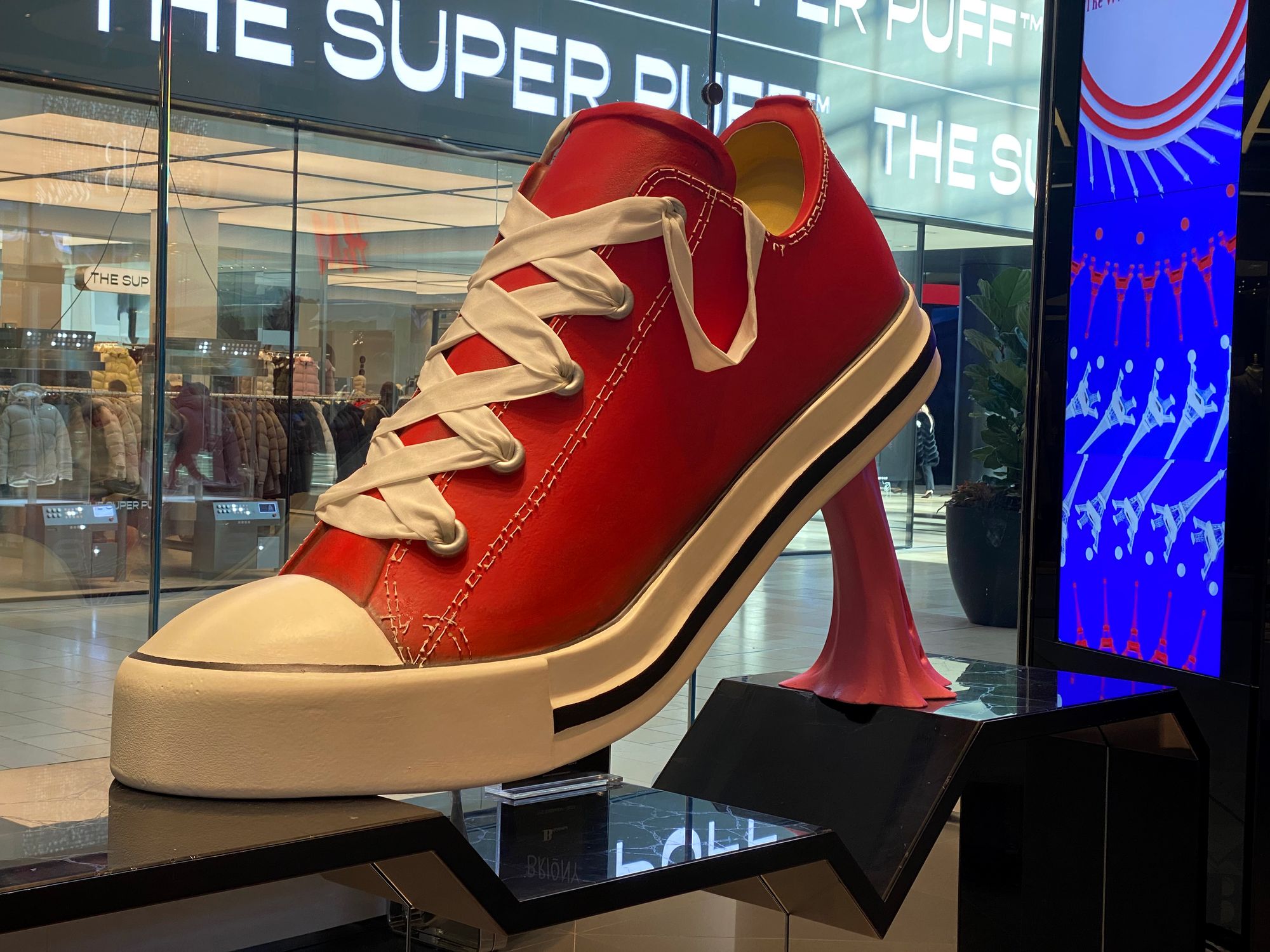
If you're taken with this exact display, and have the budget for a splurge, you're in luck. One of my favourite vintage dealers, Atomic Design, happens to have an oversized plaster sneaker available right now:
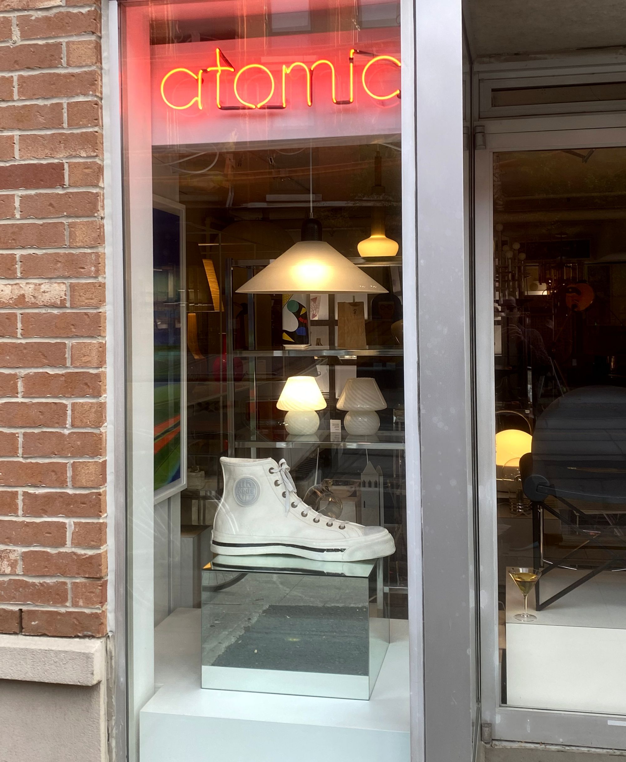
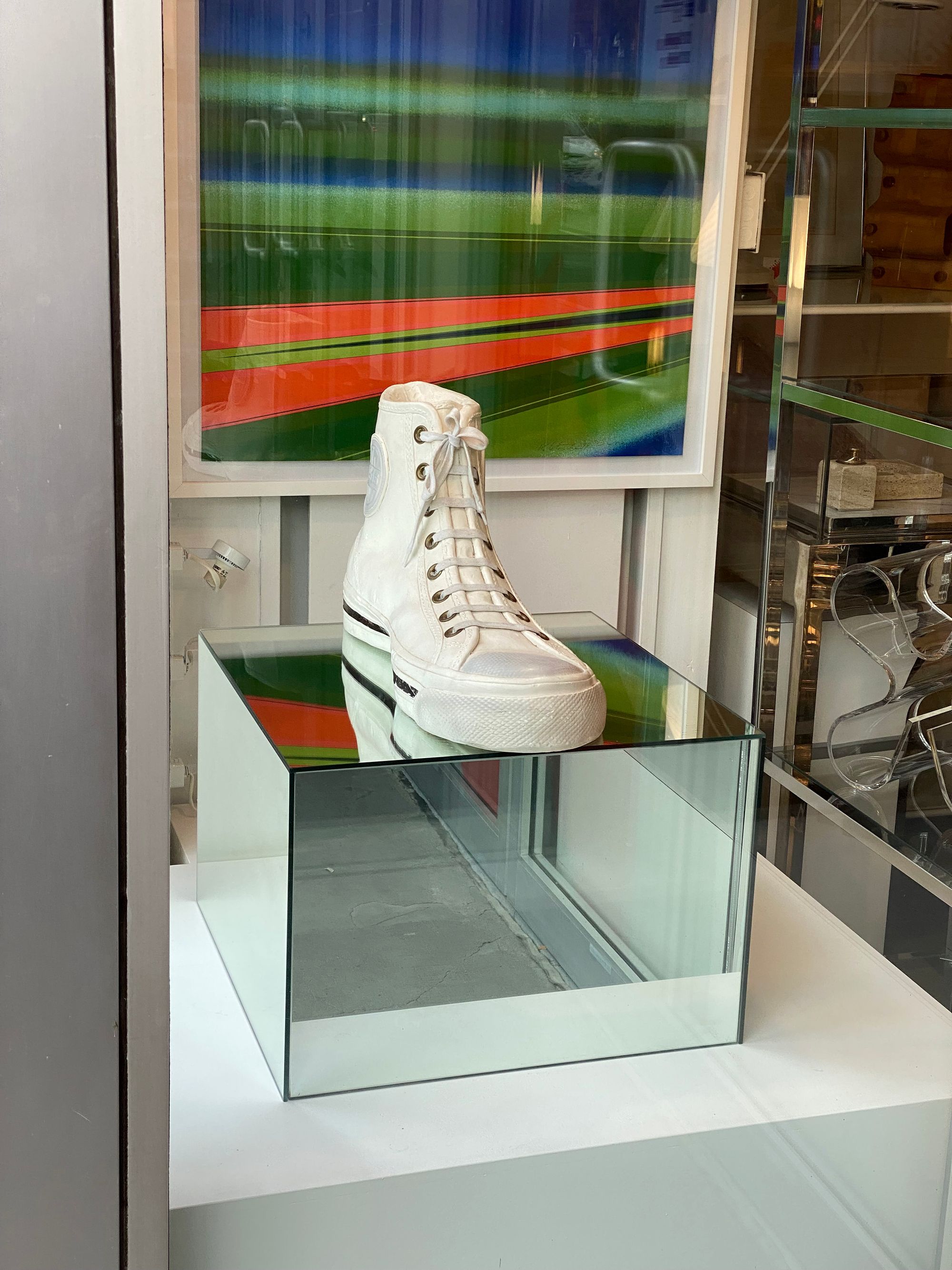
If you'd rather take it slow and start with smaller gestures, get some ideas from the guy with an eye back issue titled Make it Pop.
Danish Pastry House
Even the places you stop for a snack are potential sources of inspiration. Here's a tempting sight:
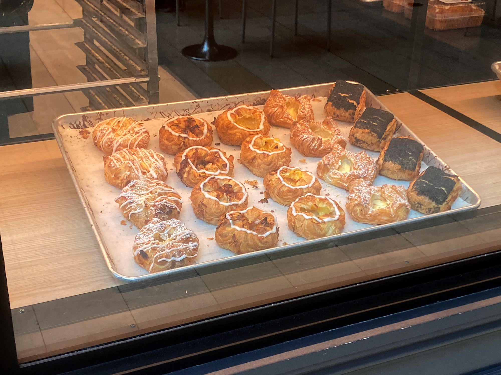
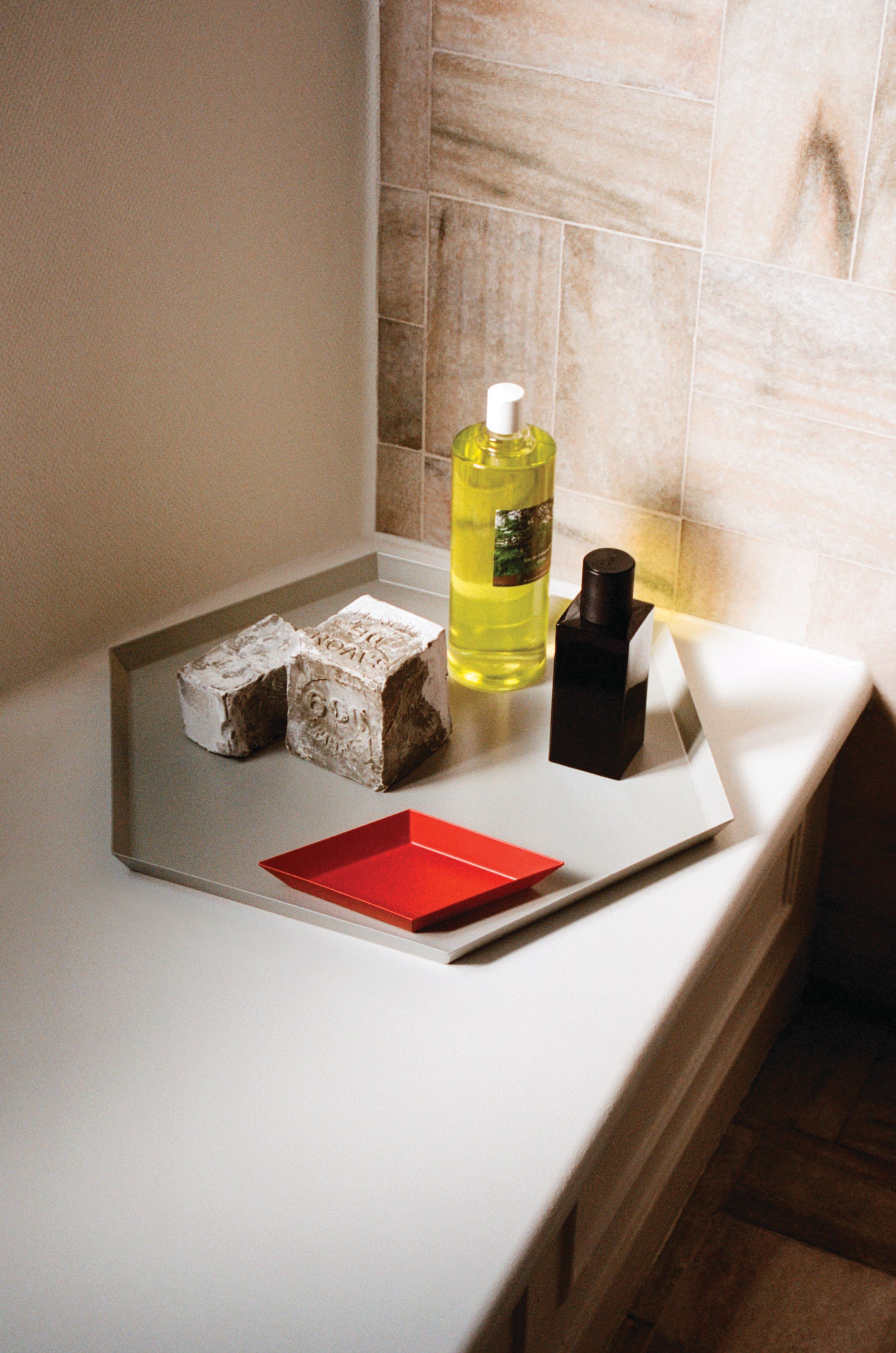
The boundary-setting property of a tray makes whatever you put on it seem more considered. Add some arranging in rows, some twisting to the diagonal, and you're in business.
Chance are you already have a tray at home and also things that would look good on it. So why not experiment?
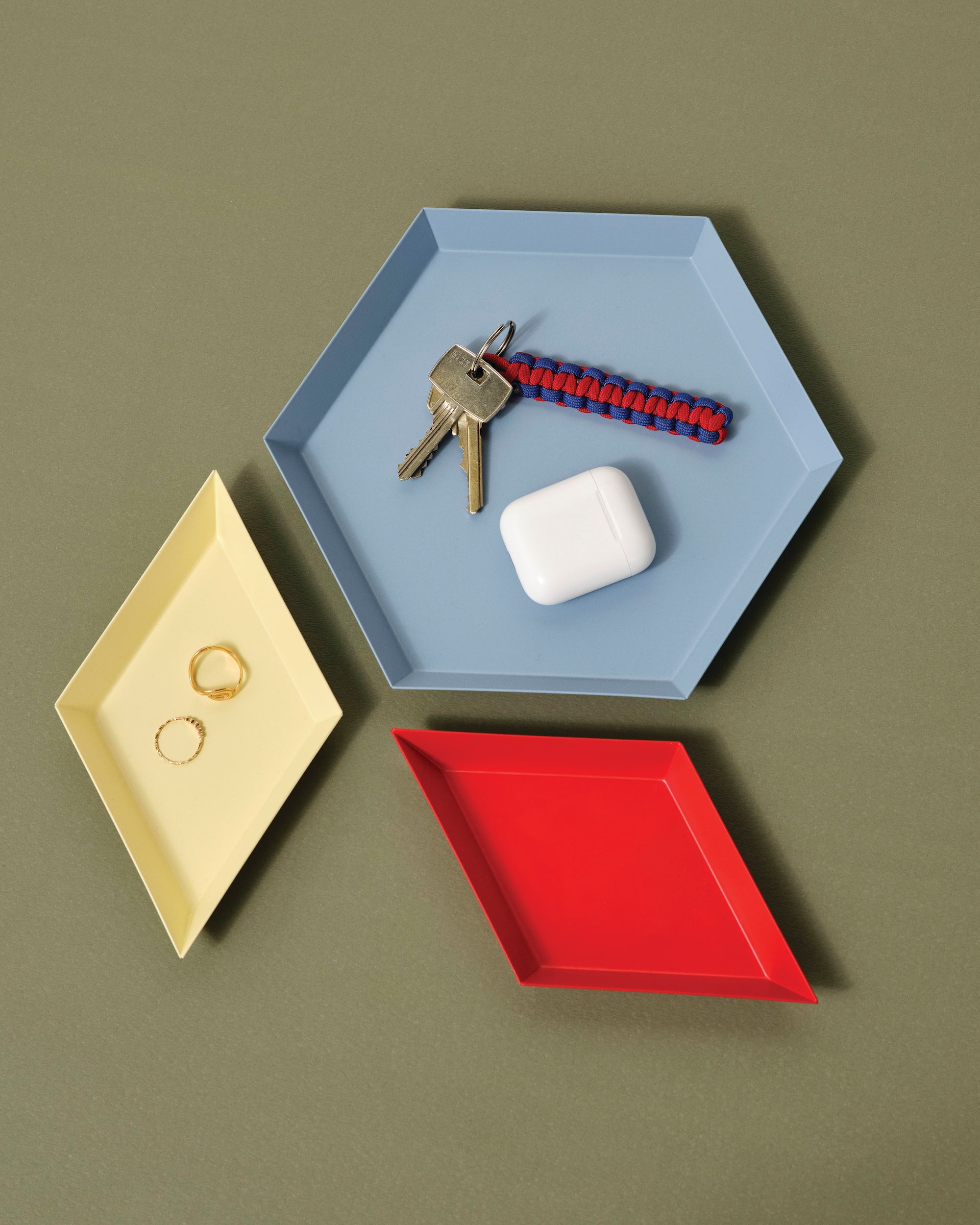
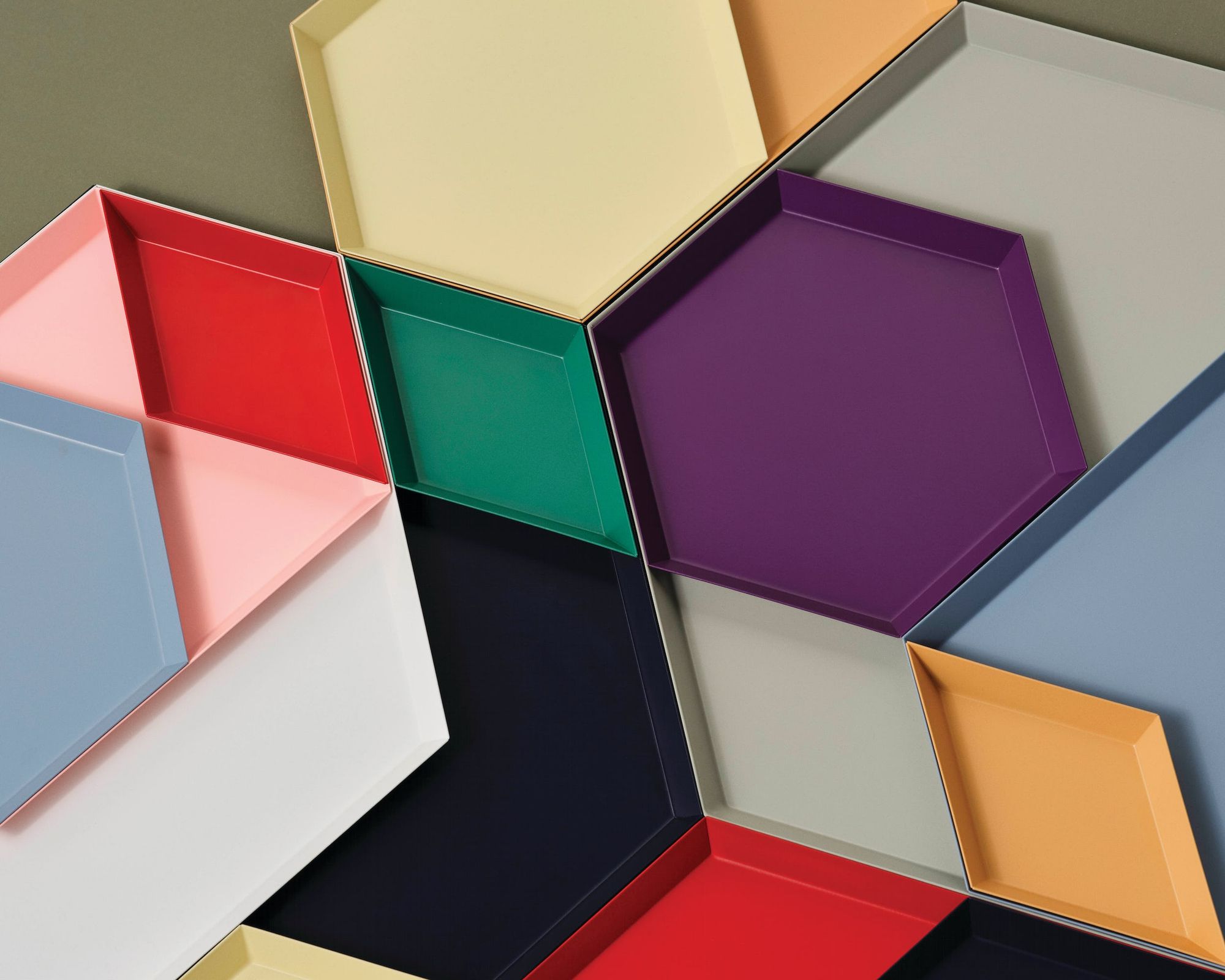
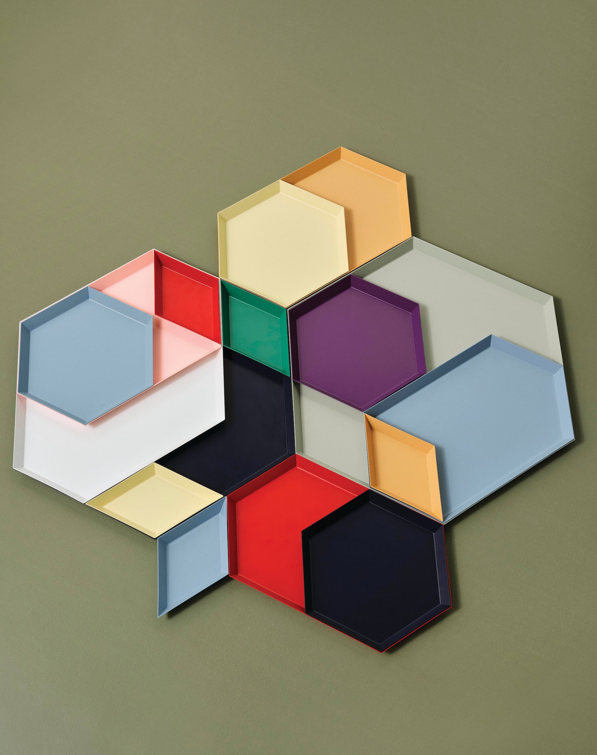
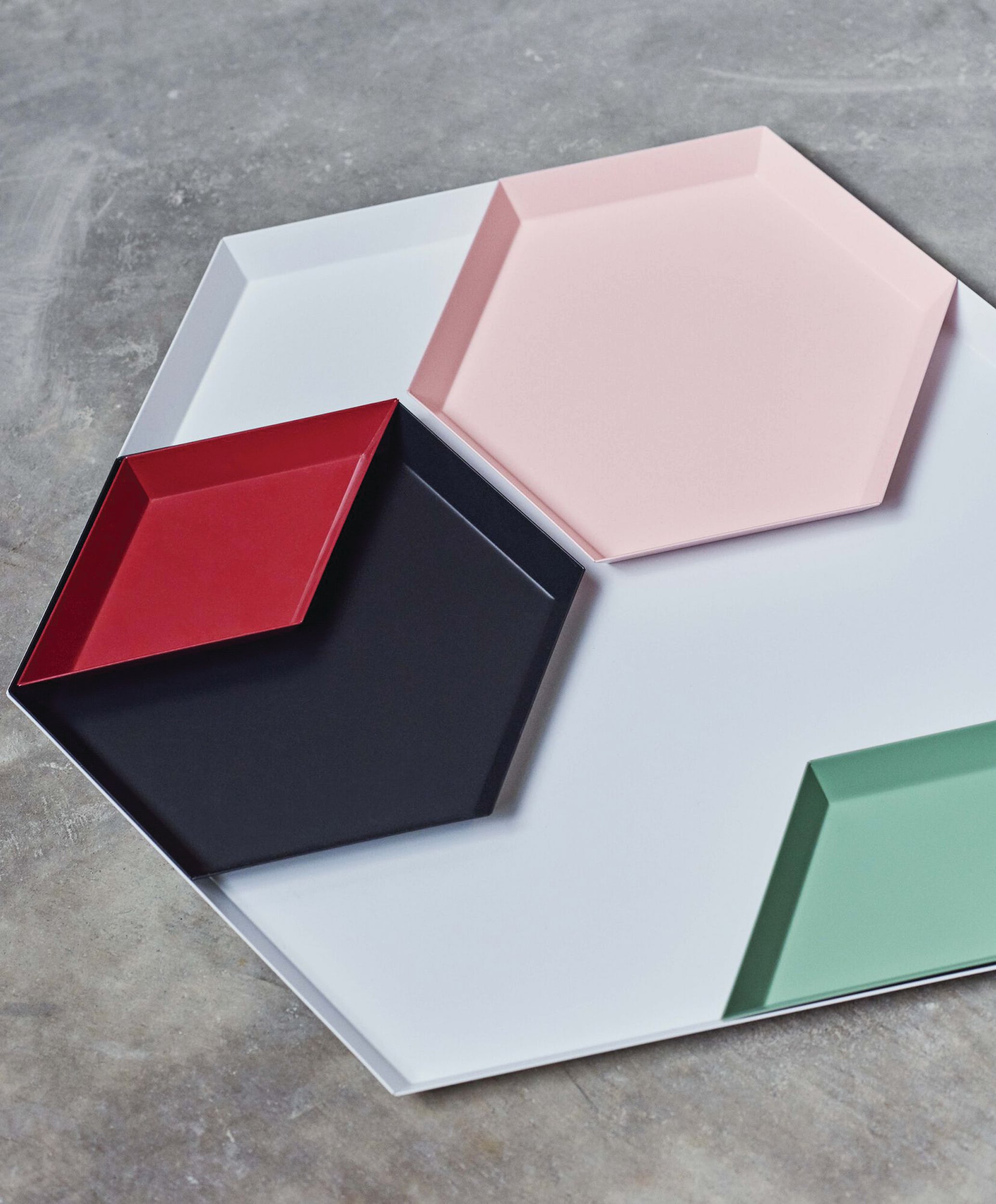
For an extra kick, try the Kaleido trays by Danish firm Hay, whose interlocking shapes make arranging the trays themselves a pleasure:
From the archives
Want some fuel for your next shopping – or should I say shoplifting – expedition? Check out last year's newsletter issue celebrating the new browsing.
Thank you for reading.





Member discussion