Going nuts for numbers
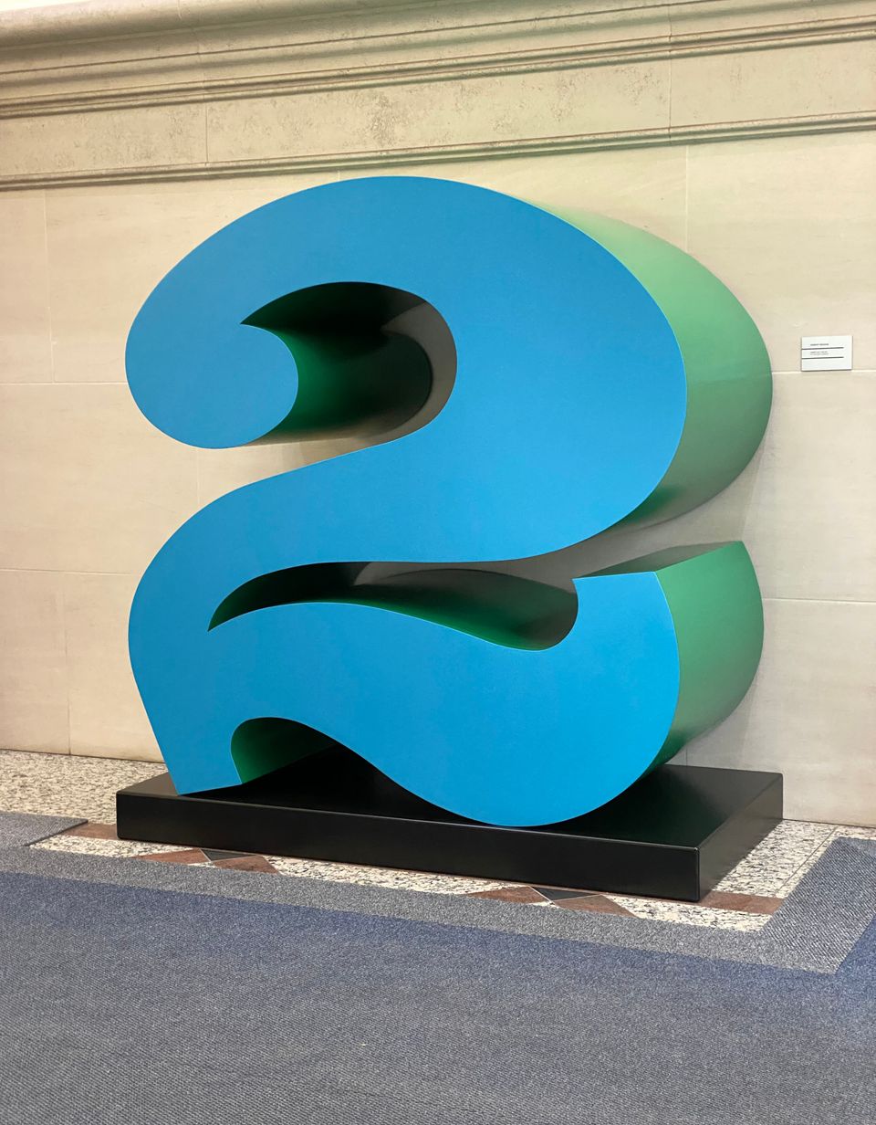
My favourite public sculpture in Toronto is the gigantic numeral pictured above. It's fittingly located in the lobby of 2 Carlton Street and I used to admire it on the way to and from my doctor's appointments in the building.
It's hard to say why I love it so much. Maybe it's the way it merges Sesame-Street silliness with imposing scale – it's around six feet tall – resulting in a presence at the same time playful and grandiose.
It's a work by Pop Art pioneer Robert Indiana, best known for his once-ubiquitous LOVE motif with its stacked capitals and diagonal "O." The sculpture's location hints at one of the most overlooked elements of interior style: numbers.
If you own a house, you've likely devoted care and attention to the digits that identify your dwelling from the street. If you're an apartment person like I am, your numerical creativity is indoors-only – but limitless if you make an effort.
Take this punchy prop from a film set that I picked up at one of my favourite vintage dealers, Williams Design:
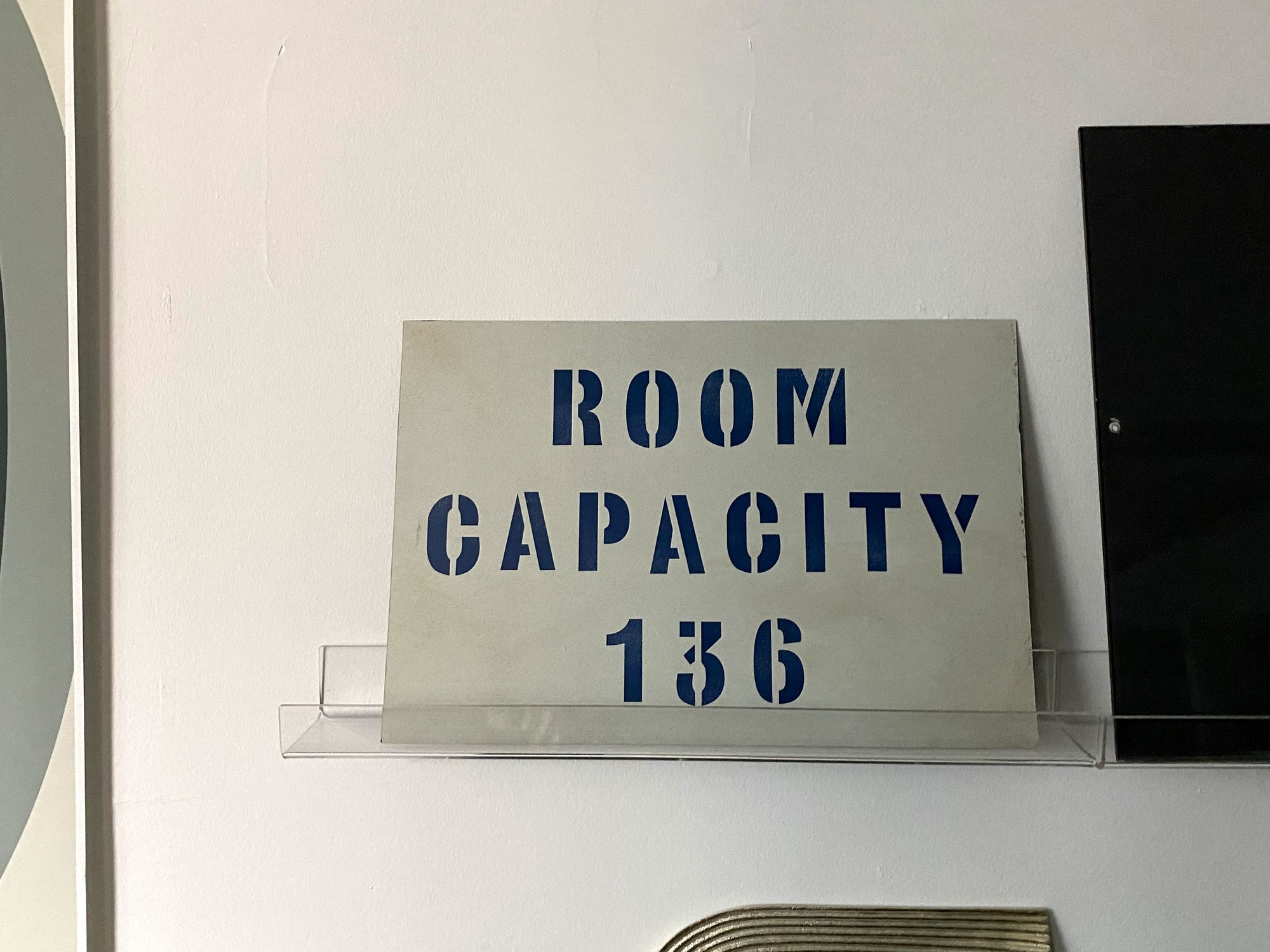
I was pulled in by the stencilled type, but also the comically precise number. The piece was a hit at my small Christmas gathering (five guests) and I'm still dreaming of the day I break the rule and invite 137 to my compact bachelor pad.
Graphic intrigue attracted me to this poster as well, the focal point of my home office:
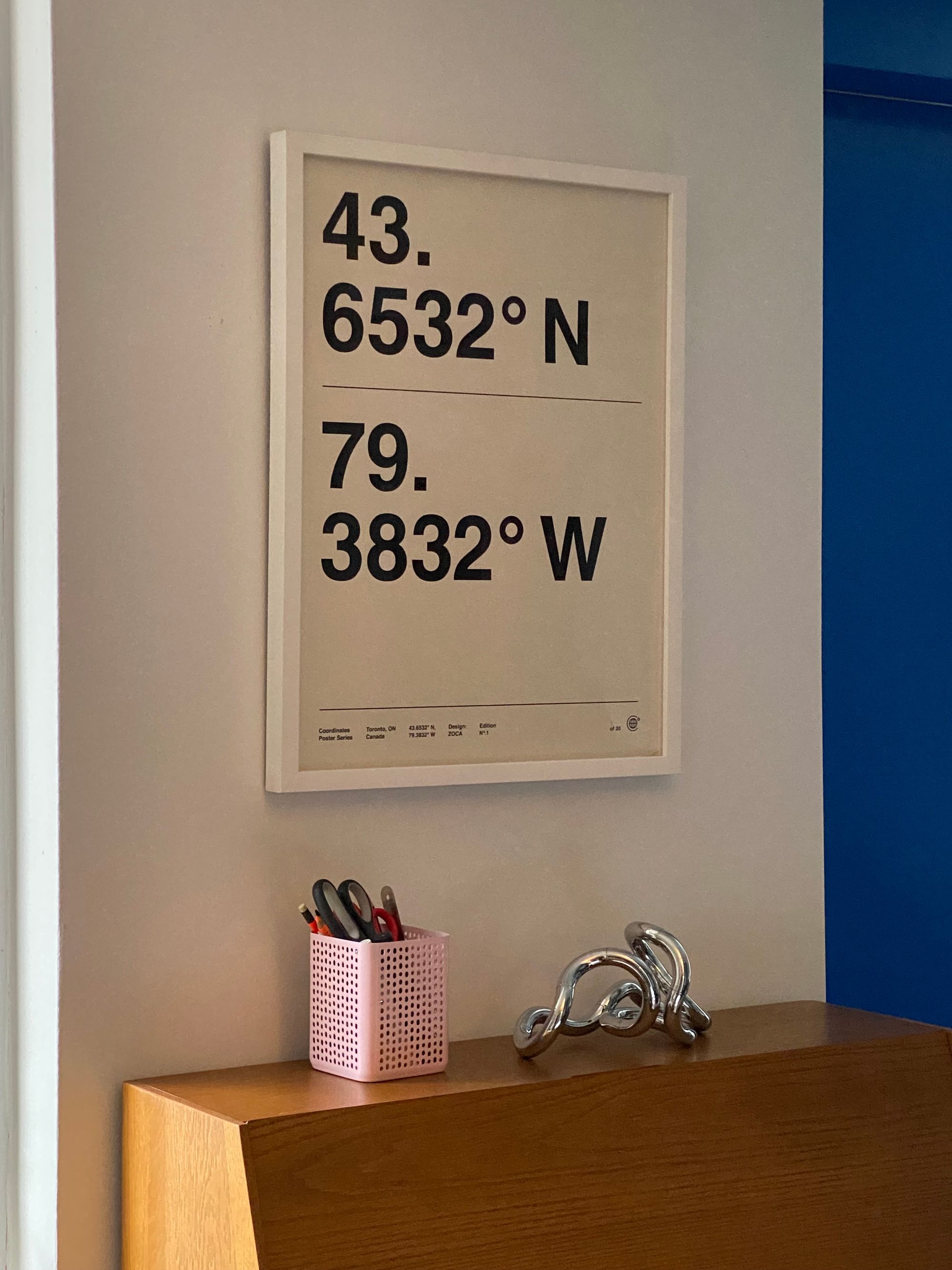
The numbers are appealing with no explanation, but when you discover the secret – they're the geographical latitude and longitude of Toronto – there's another reason to smile. It's part of a coordinates poster series by Zoca Studio, turning places into breathtakingly simple designs.
As Indiana knew well, a number on its own is most powerful of all. For further proof, check out the poster that dominates my living room:
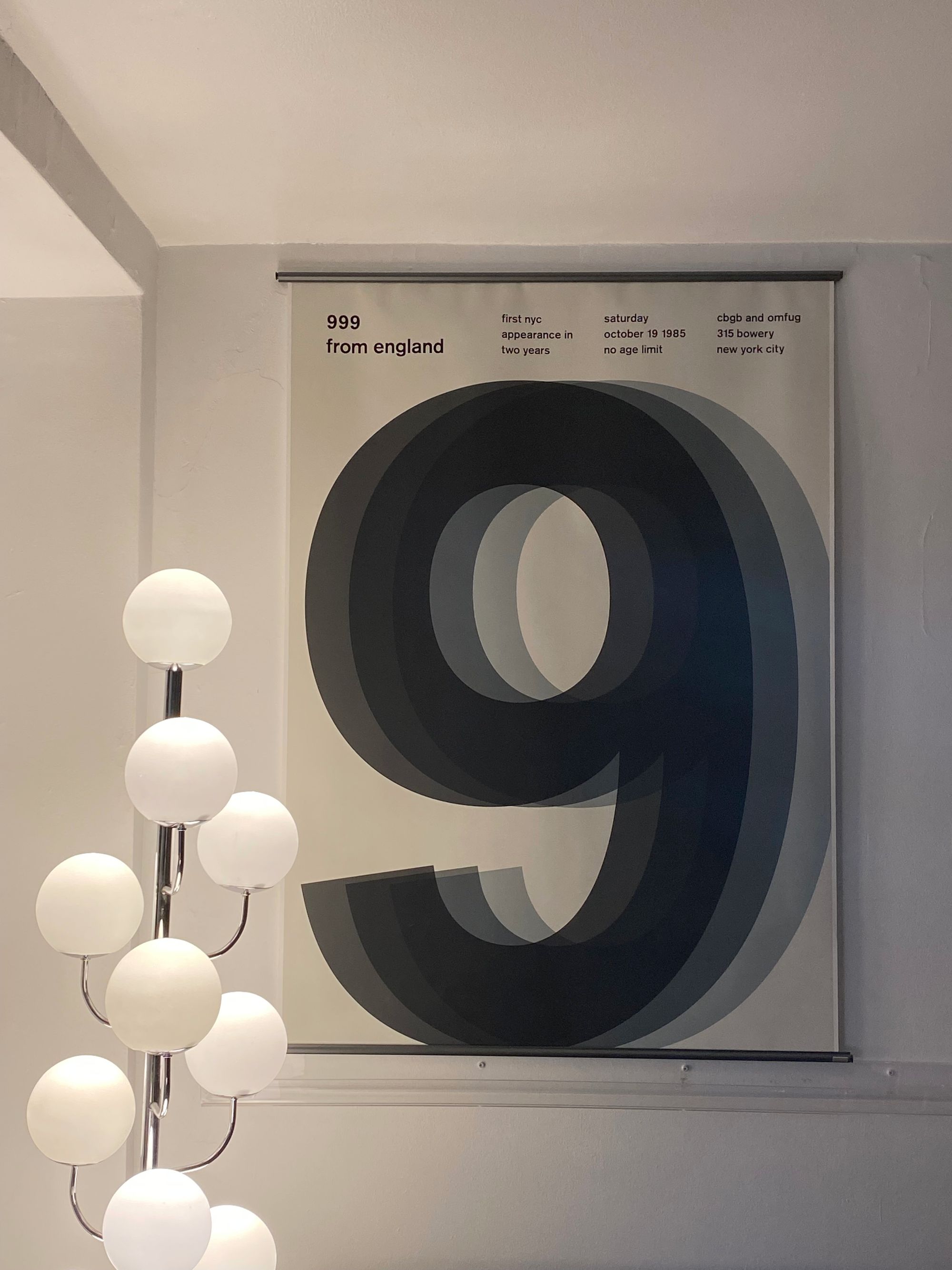
It commemorates the English punk rock band 999, or a 1985 show of theirs in New York to be exact, part of the Swissted project turning eighties concerts into graphic design knockouts. I wasn't familiar with the group at all, just enjoyed the way the layered numeral conveys the loud frayed jittery energy of a musical epoch.
Back when I wrote about typographizing your home, I observed that letters presented individually have a relaxed, off-duty quality, released from the obligation of spelling anything. A single digit, though, is forcefully specific.
If displaying numbers for their aesthetic qualities alone seems self-indulgent, there's always their time-keeping properties to rely on as an excuse. Massimo Vignelli's Stendig calendar, designed in 1966, keeps you situated in the year while making any room look more stylish:
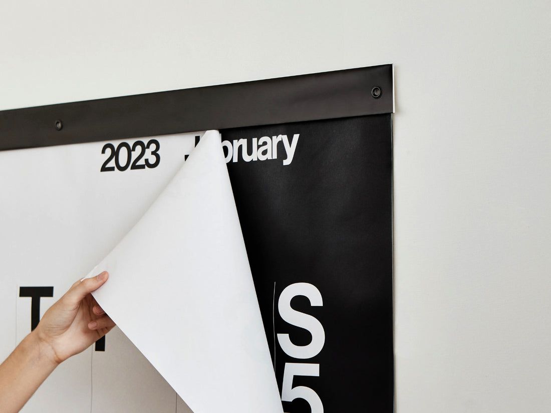
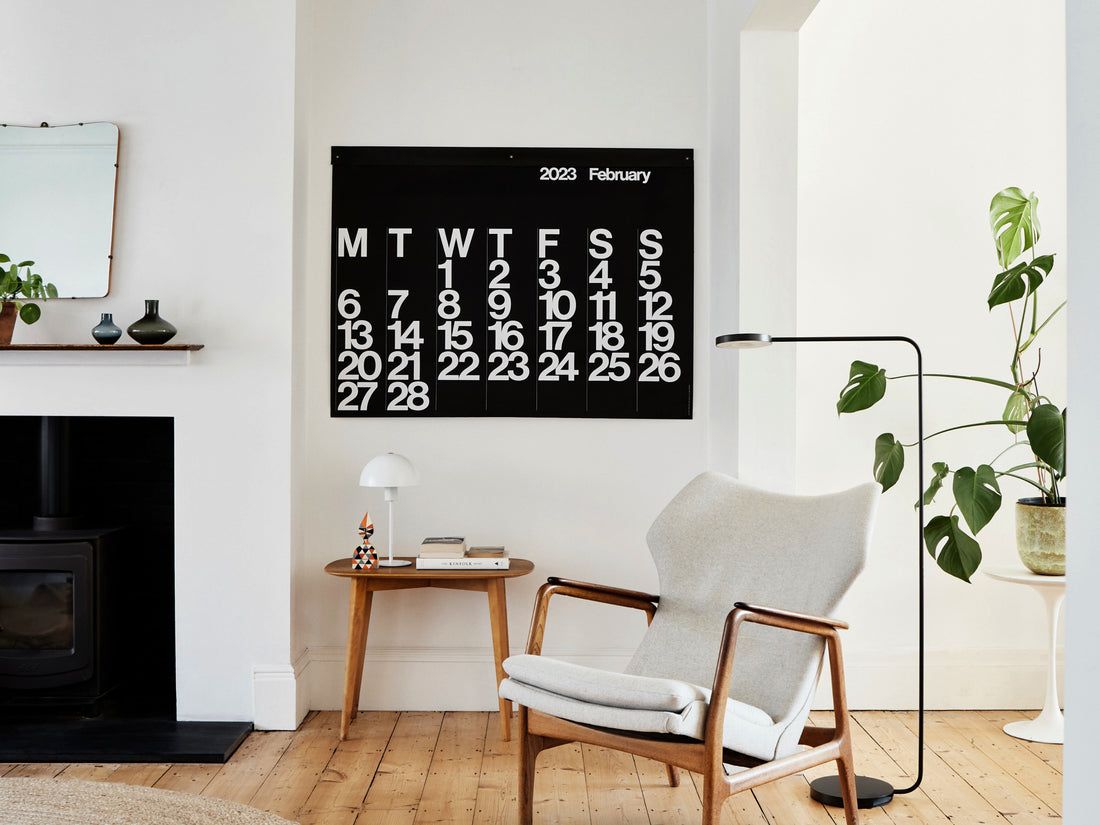
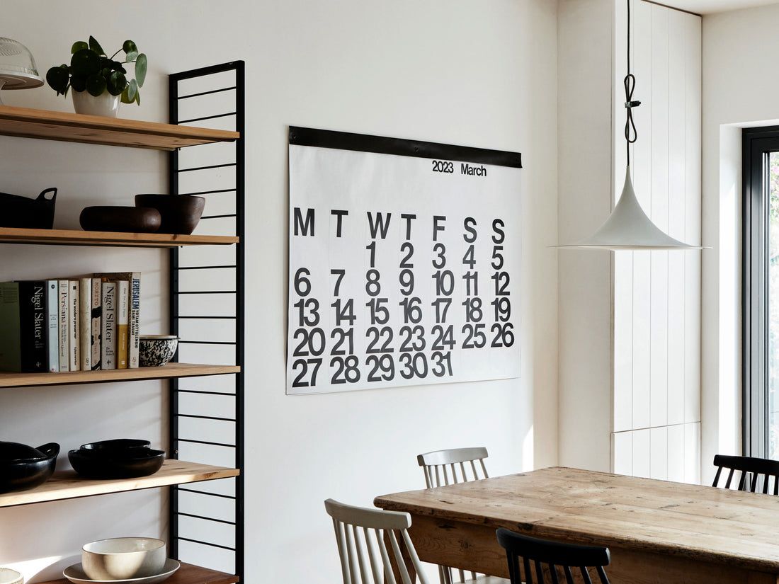
The pages alternate between black-text-on-white and white-text-on-black, giving the passage of time a snappy visual rhythm.
Wall clocks offer a set-it-and-forget-it way to include numbers in your home. My favourite kitchen appliance is this vintage Lorus timepiece from Zig Zag:
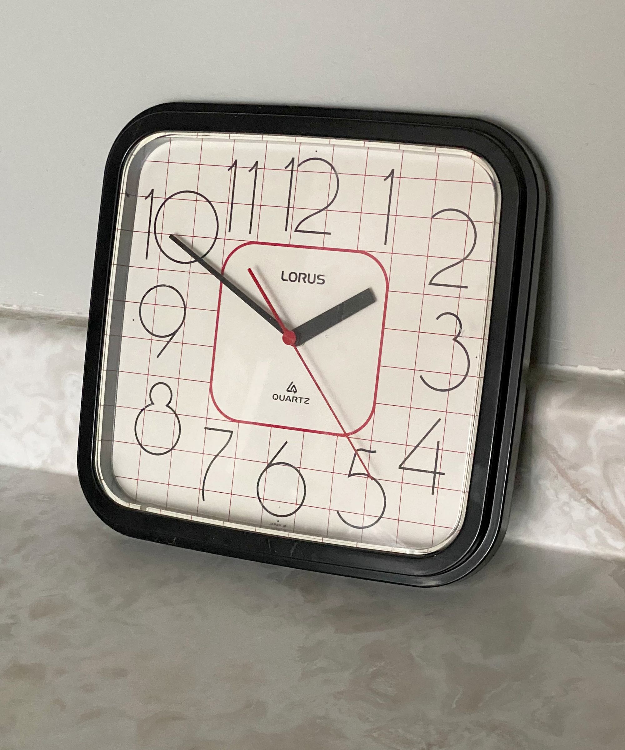
I couldn't resist the snowman-like number eight, and on further study fell for the top-heavy number two as well. So many modern clocks have discreet metallic rectangles in place of numbers, or anemic circular bumps, or no markers at all, so it's a joy to own a clock that embraces the power of type.
While I'm not a superstitious person, there's a set of four digits that means the world to me: 12/12, due to my birthday being the twelfth of December. Whenever I catch sight of a digital clock at 12:12, pass 1212 on the street, or encounter those numbers in any other form, it feels like a moment of grace, a sign of something good about to happen.
If you've ever wondered why this newsletter always appears at 12:12 p.m., you have your answer. It's my way of passing the positive vibe of those numbers on to you, my dear reader, once a week.
Until next Wednesday,


Member discussion