Frame: micro-decorating move #19

The weekly micro-decorating newsletter * Issue 2 of 13, SS24 *
Subscribe free *
Framing doesn't have to be a big commitment. Sure, you can invest in an expensive setting for a favourite piece of art... but your taste may change, your wall may start looking tired. Why lock yourself in?
Casual framing is a more fluid way to highlight your treasures. One of my favourite methods is to prop a clipboard against a wall and use it to call attention to something noteworthy. As a lover of typefaces, I enjoy the way this can foreground a single letter of the alphabet:
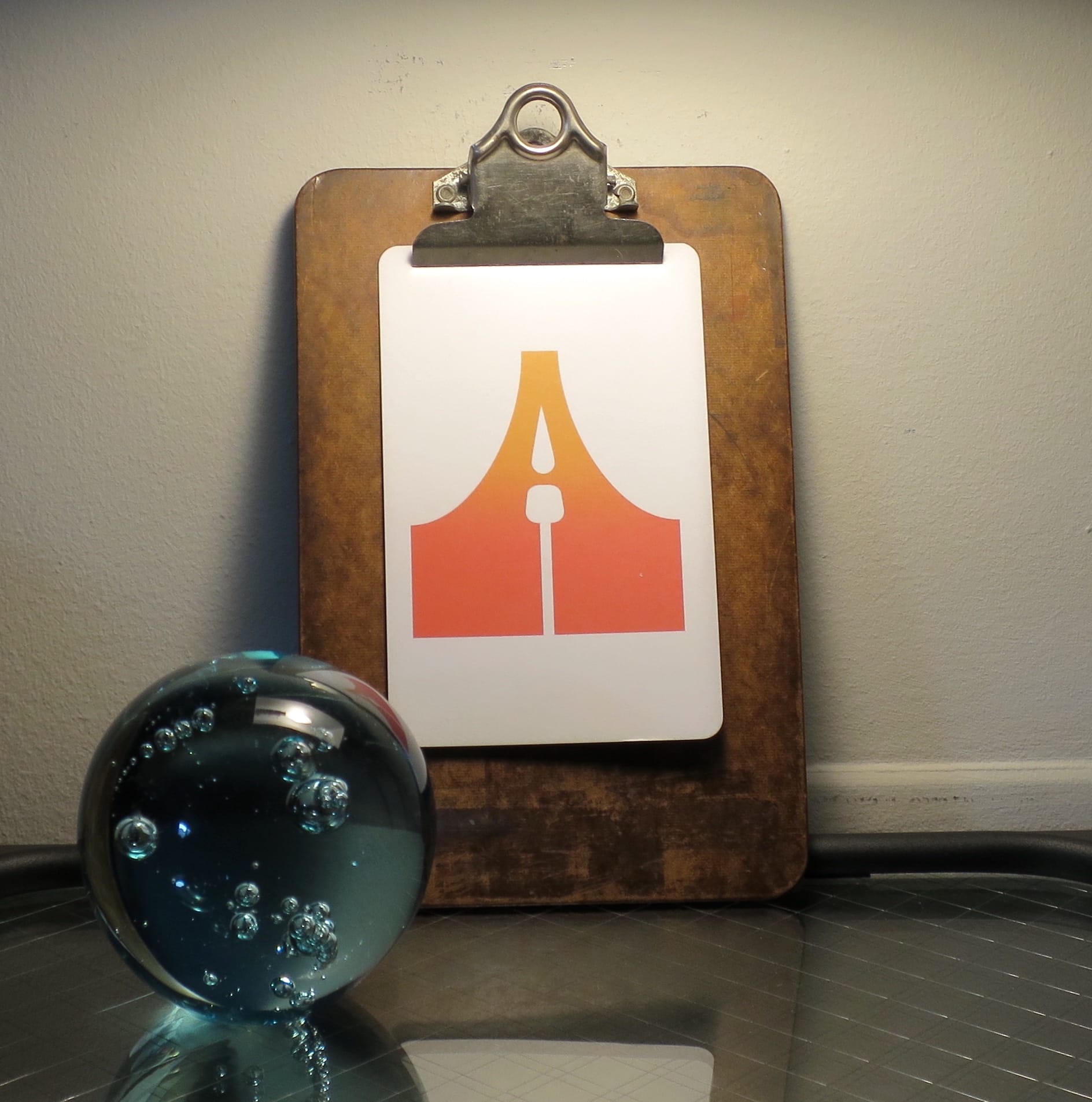
It helps to use a clipboard with some patina, so check out flea markets and thrift stores for reclaimed models that have character.
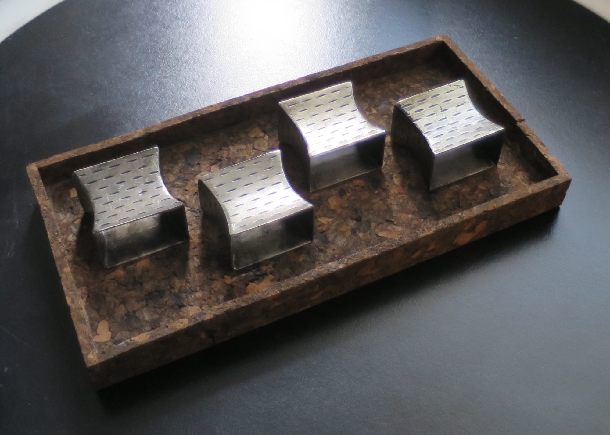
Once you've stopped being literal-minded about frames, new possibilities emerge. A frame can be horizontal as well as vertical. Try using a small tray to focus attention on something normally overlooked. Here's a bunch of brutalist napkin holders that come into their own against a cork backdrop:
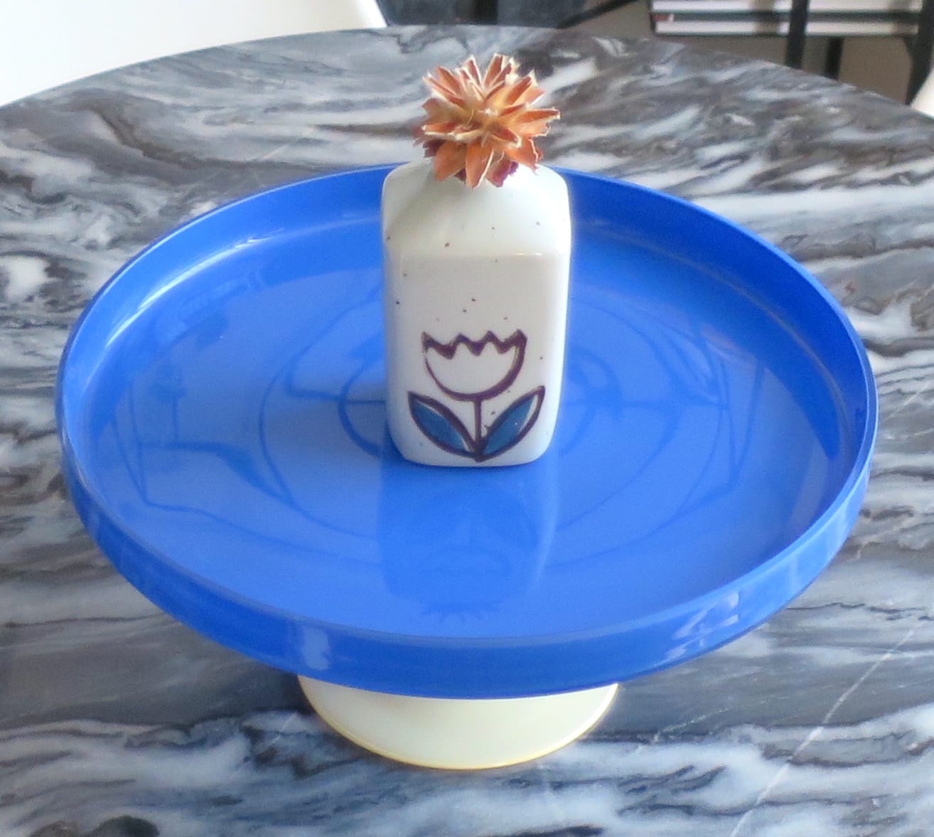
Who says a cake platter has to be used for cakes? It's another horizontal frame, useful for showcasing an item that might otherwise get lost in a room with lots going on:
A fridge door is a natural frame, and you've likely got the magnets to make small-scale exhibitions... but have you considered your stove?
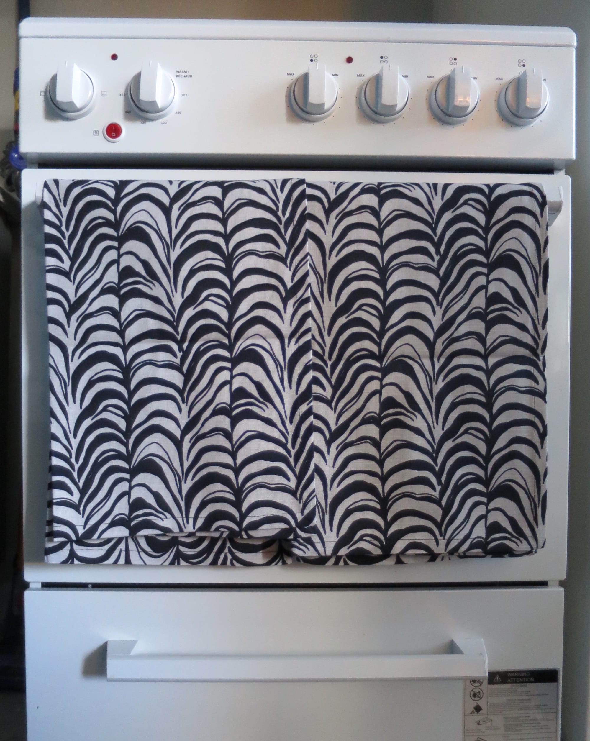
Drape some tea towels over the oven door's handle, and give your eye-catching textiles a place to fully come to life. (If you need some fresh versions, you can find the ones above marked down at CB2.)
A cutting board isn't just for chopping. Give it a day off and see what happens if you use it as a parking lot for colourful objects:
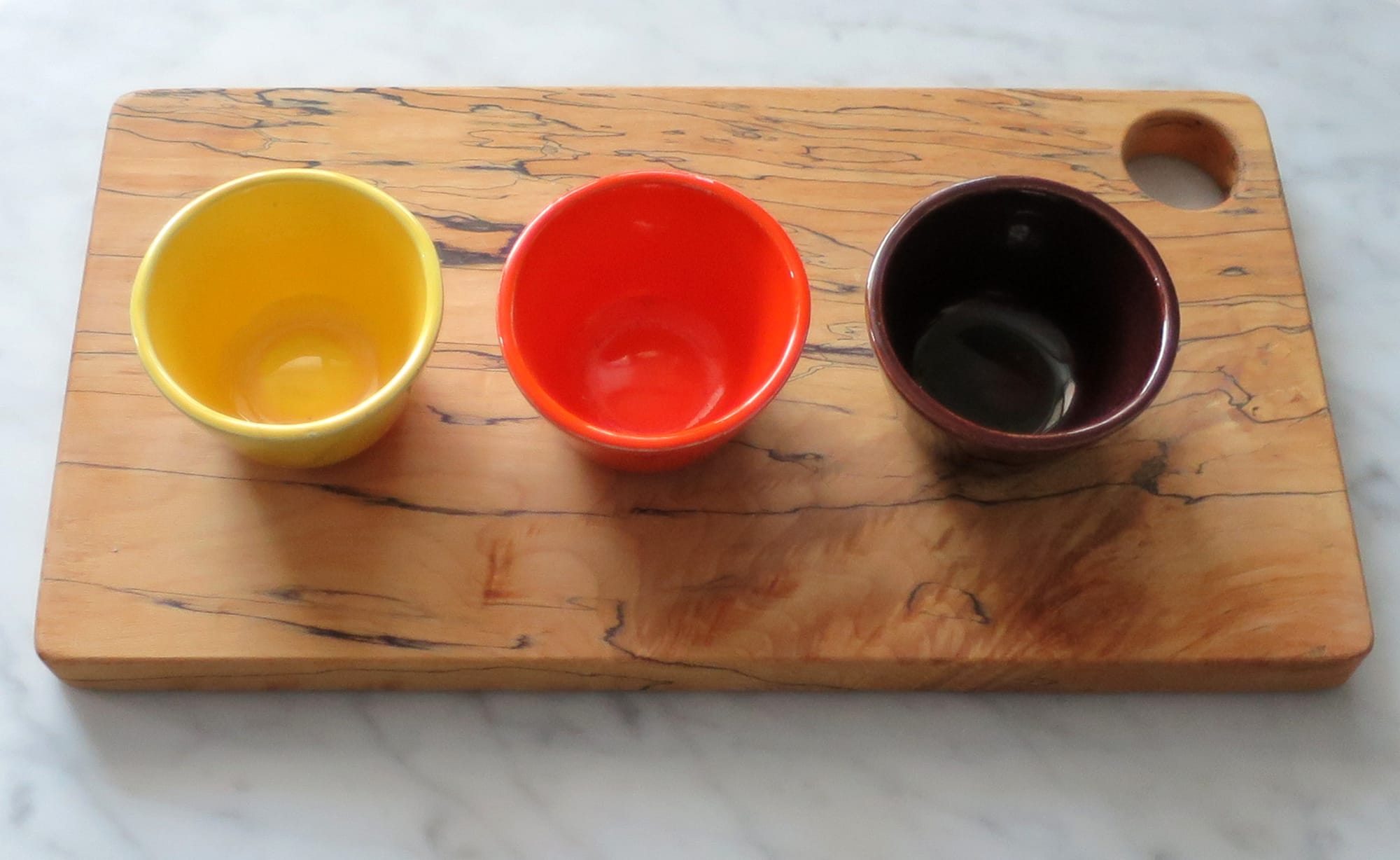
Once you start identifying the less showy frames in your home, you'll find them just about everywhere. Play with arrangements. See what happens when you set up a frame within a frame:
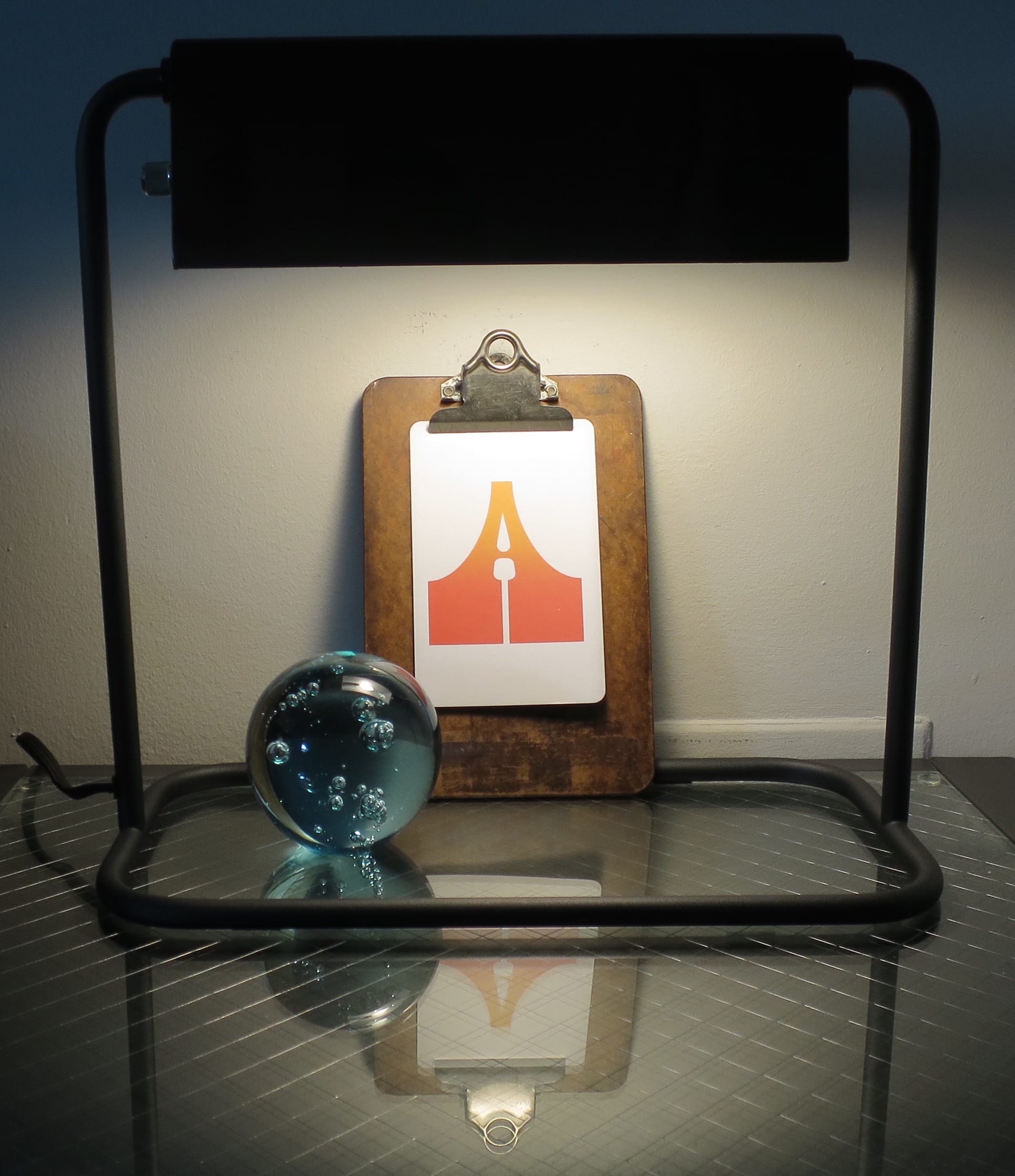
The beauty of this informal framing is it allows for quick updates and even silly experiments. It's a great way to be more creative at home.
Sale alert
Every so often, I come across design books that are in perfect sync with this newsletter's theme. Here's one that I spotted at Indigo earlier this month:
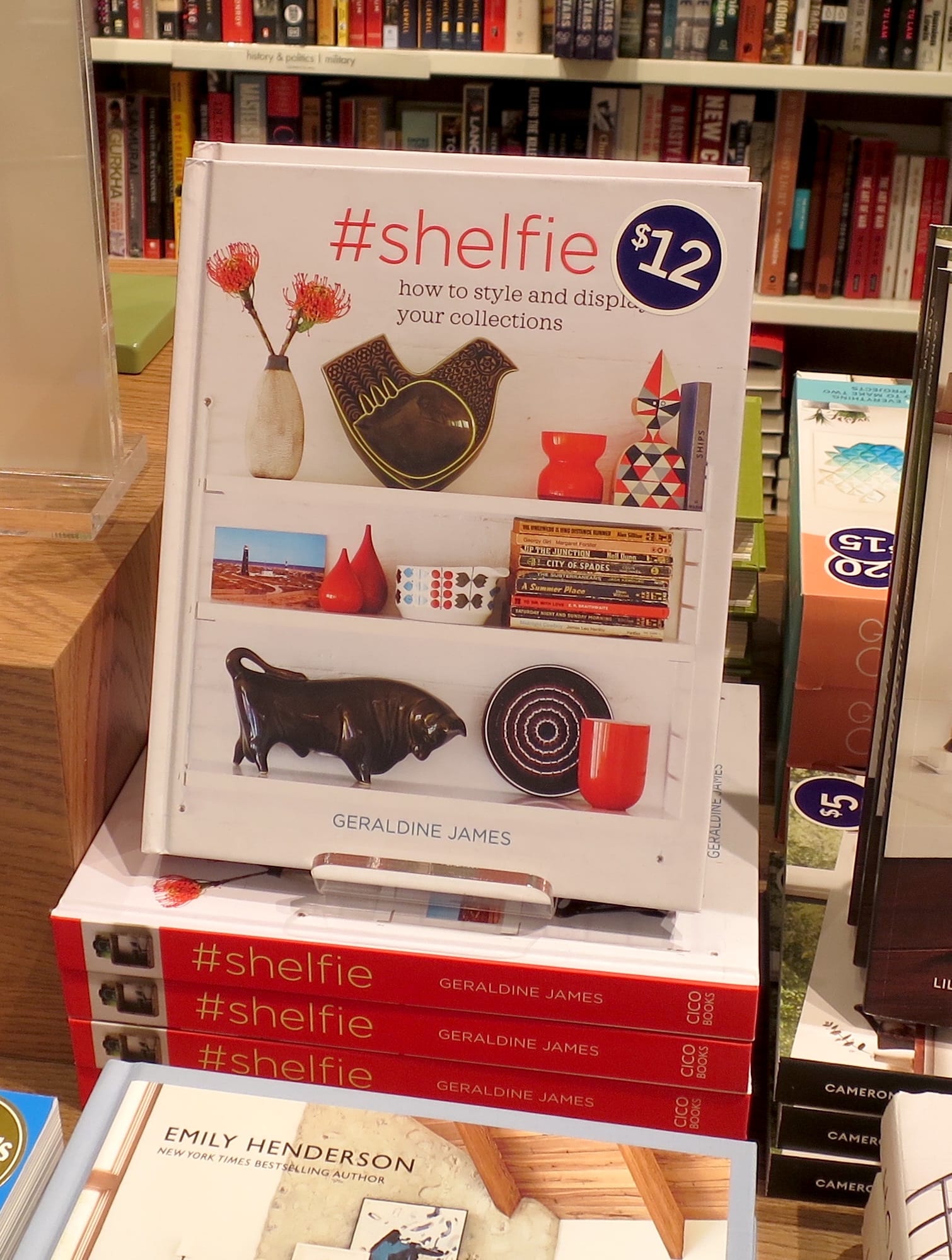
It's full of photos that will get you rearranging your shelves with glee. Strangely enough, the book itself is a good starting point for a display. Prop it up against a white wall, like I did in my living room, and it gets you at least halfway to an appealing corner:
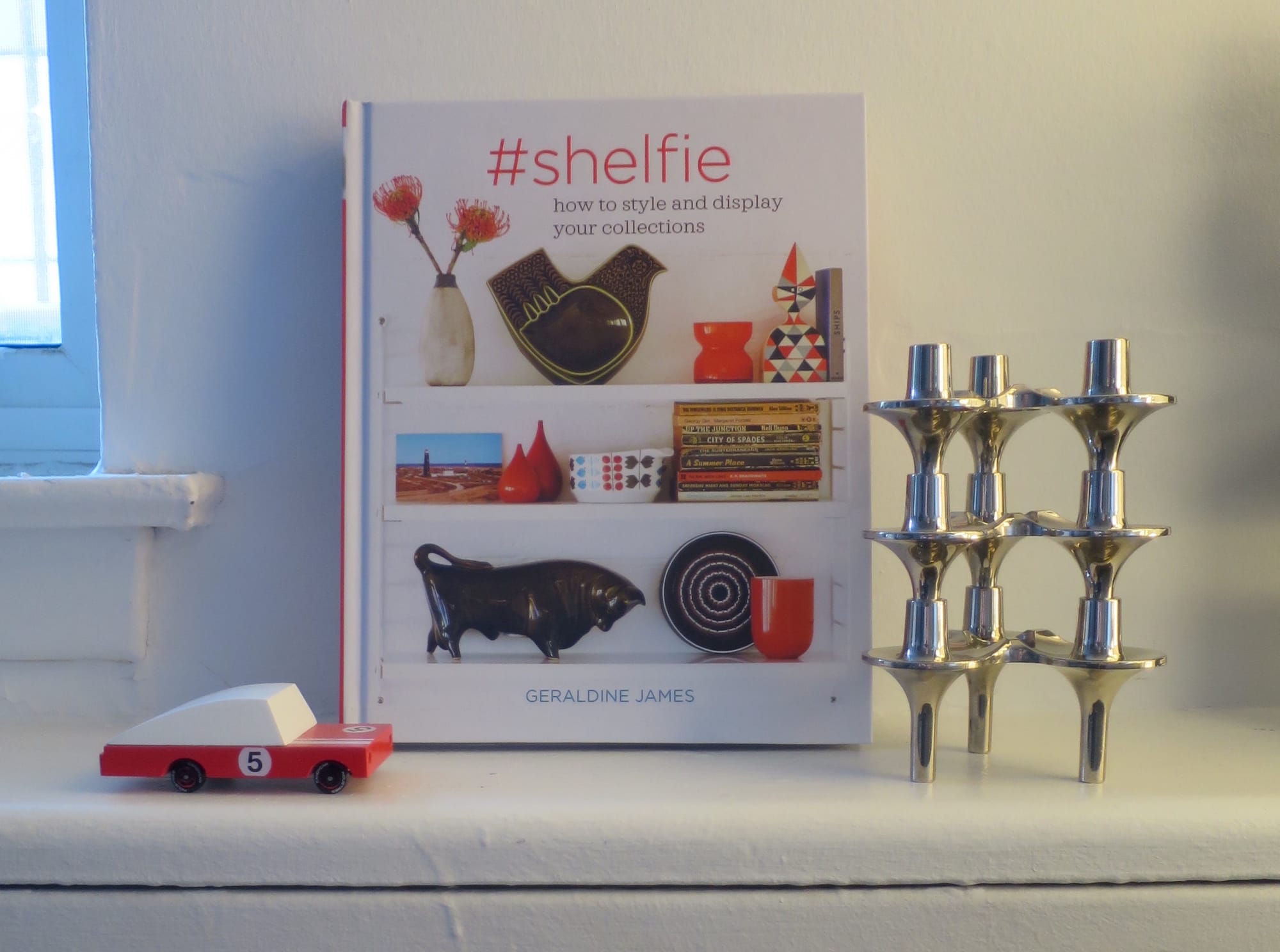
For some reason, the website version is still twelve dollars, but visit Indigo in person and the title is marked down to only six bucks. If you're tired of scrolling Instagram and finding it's forty per cent ads, you'll likely appreciate this more contemplative version of seeking home inspiration.
From the archives
Last season, we took a look at the mantra "Your shelf, your self" to see if it held up to scrutiny. Check out our findings, now available to subscribers only.
Thank you for reading.





Member discussion