Don't make this common mistake when choosing a paint colour
One of the fastest ways to transform a room is with a new wall colour. It's also one of the most nerve-wracking, since choosing the paint can send you down a rabbit hole of possibilities.
I thought of this potential crisis when planning a complete colour overhaul of my home. Fortunately, I've experienced a cautionary tale that keeps me from making one of the most common mistakes.
When I was in my final year of university, I lived in a shared house on Ossington Avenue and as soon as the five of us moved in we set about customizing our rooms. One of my housemates decided to take a creative approach to choosing paint colours: he would select them strictly based on his visceral reaction to their names.
It sounded like a good idea. Why not be adventurous, let the verbal cues fire up your imagination and see what happens? To this day, I still remember the paint colours my friend chose based on this method: Banana Daiquiri for the walls, and Poe's Raven for the trim.
They looked hideous together. As he spun around slowly in horror and assessed his handiwork, he realized he had made a grave error. His scheme had backfired.
The perilous journey
I'm telling you this story for a reason. Even though you're unlikely to go as far as my friend in consciously surrendering your aesthetic compass to colour names, you're being swayed by those clever word combinations anyway.
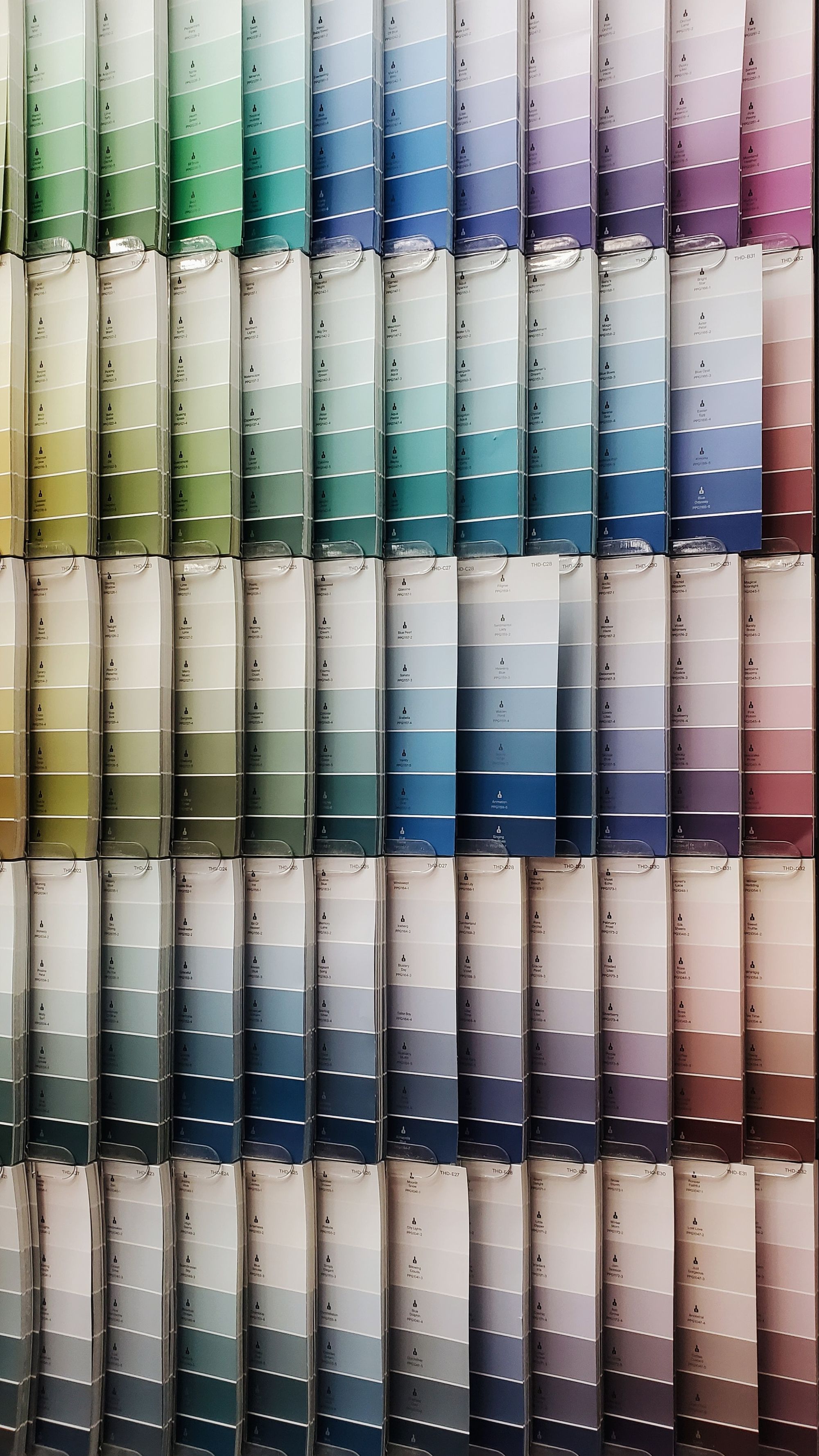
In fact, colour names are one of the most insidious forms of advertising: seductive phrases that lure you into making a decision that may not be right for you or your space.
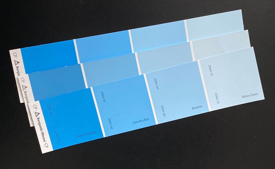
For example, here are some of the names I had to navigate recently in choosing a blue for my living room: Cumulus Cotton, Saphireberry, Caribbean Coast, Utah Sky. There's a concentrated poetry in each of them, tempting me into a potentially misguided choice.
It's no wonder that paint marketers use language this way. The amorphous and slippery world of colour seems more manageable when tamed by words. We humans crave certainty and our indecision about colours can dissipate when met by the solidity of evocative labels.
So how to choose a colour without falling into the name trap?
Anchor your decision in the real world. I'll use two examples from my home to show you what I mean.
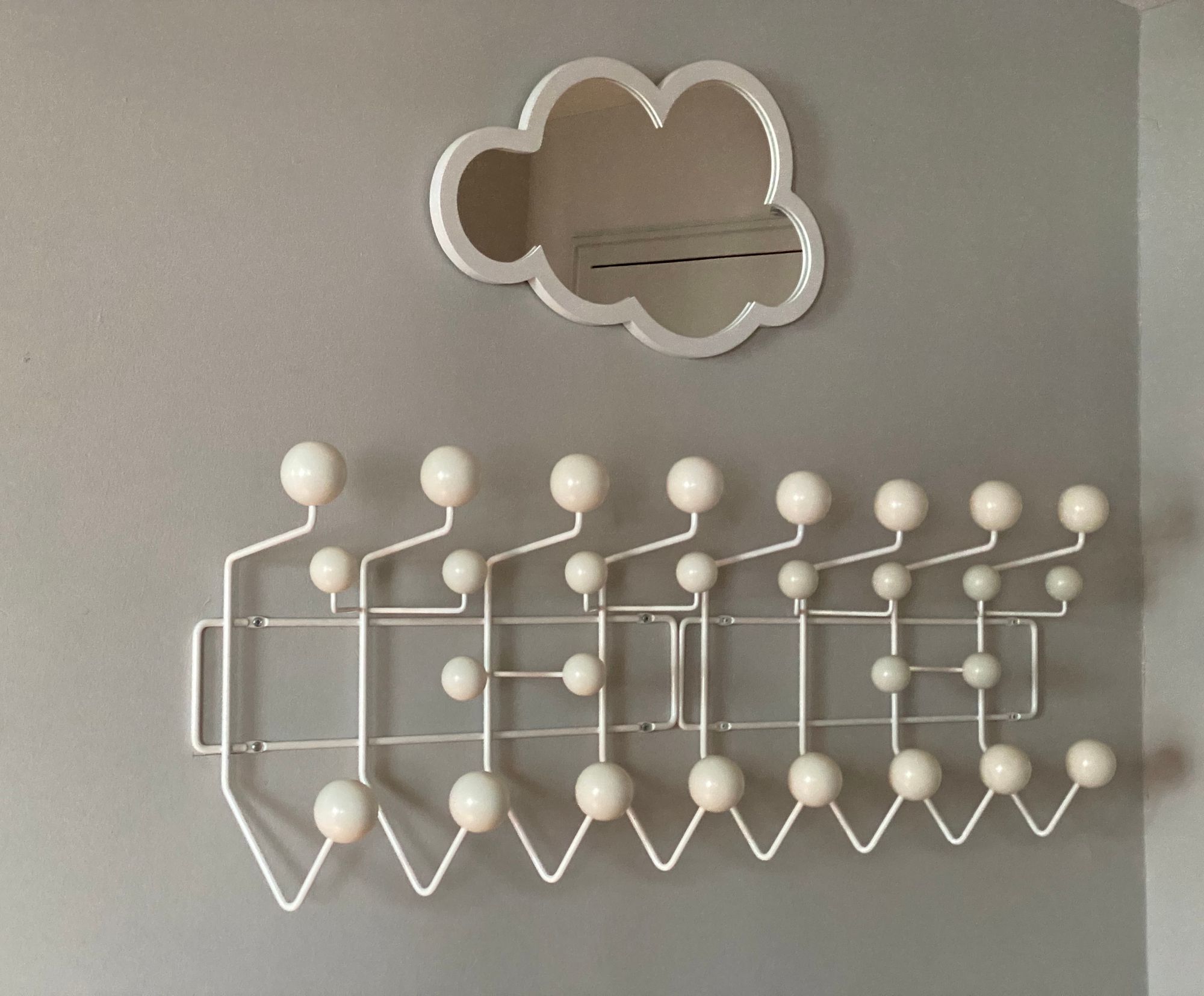
I'm a big fan of the clothing store COS, including their understated shopping bags. When choosing a colour for my entryway, I thought of using one of the bags as inspiration. I brought it to the paint store to match the gray, then mounted a pair of white Eames Hang-It-Alls on the finished surface:

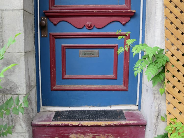
Similarly, I live near a building with Mondrian-like swatches of primary colour scattered across its black cladding. I had long admired the blue rectangle visible from my suite – and it became the reference point for the hue I painted my balcony door:


In both cases, the colour name was irrelevant because I had already made a choice based on something tangible that I knew and loved.
I urge you to do the same. You'll have the fortitude to resist the siren song of colour names. And you'll save gallons of paint and heartache, resulting in a space that's perfectly calibrated to your unique sense of style.


Member discussion